
Ötscher:Labels
Packaging Design for the Ötscher:Reich products at the alpine exhibition in the Ötscher Region.
Type: Concept, Corporate Design
Services: Packaging Design
Realized: April 2015
Industry: Manufacturing & Trade
Client: friendship.is
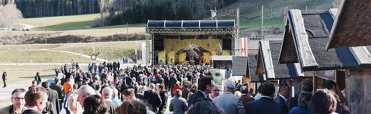

The 24th of april the alpine exhibition in the ötscher-region opened their gates under the name of „Ötscher:Reich“. at Ötscher:Reich the activities reach from exhibitions, excursions and hikes in the ötscher region, to the three stations of the alpine exhibition.
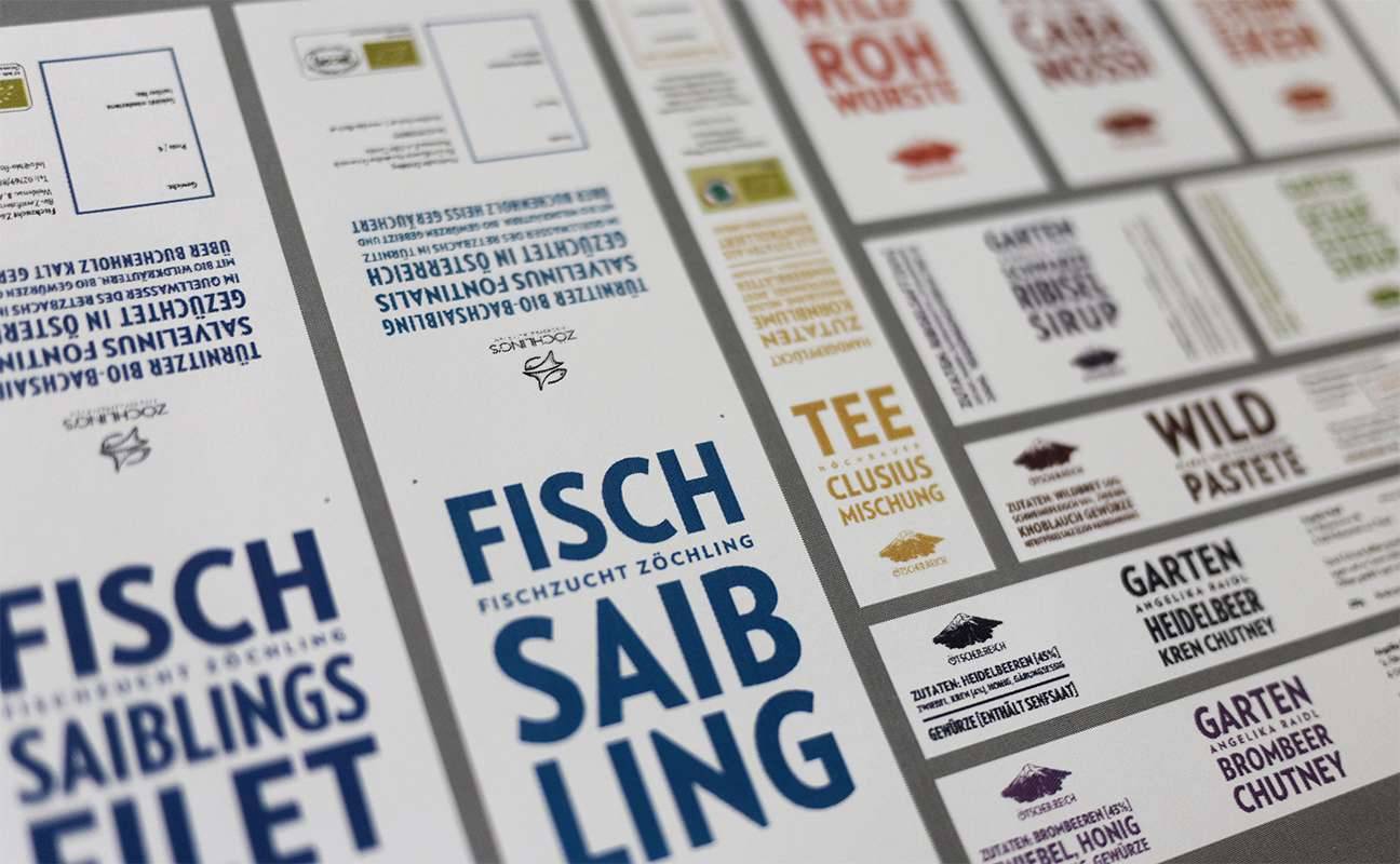
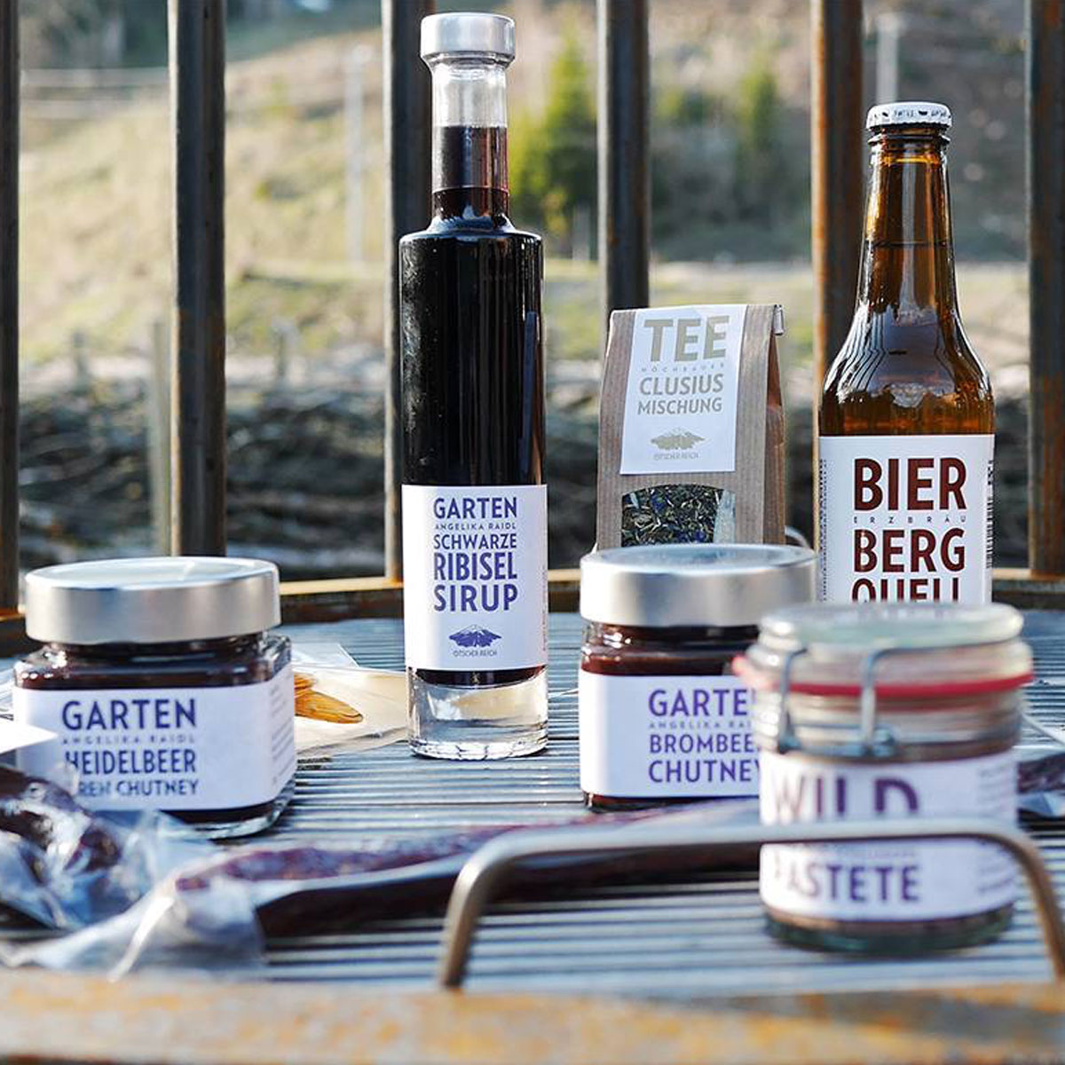
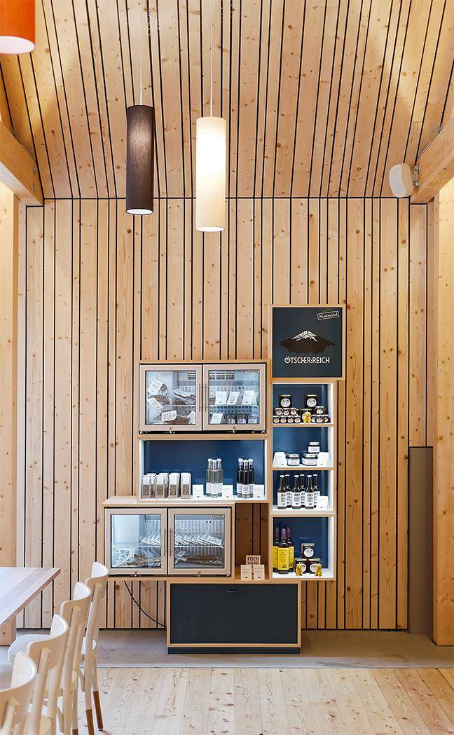
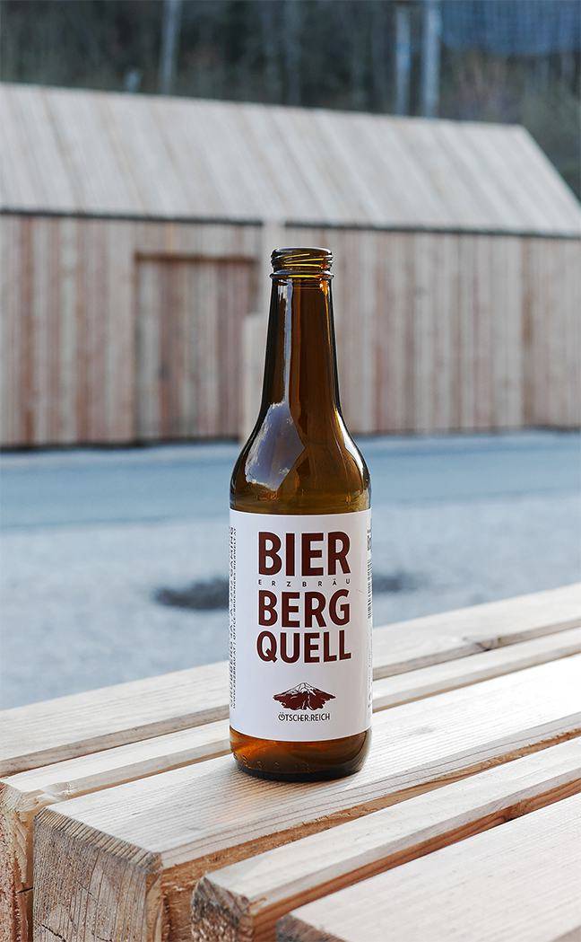
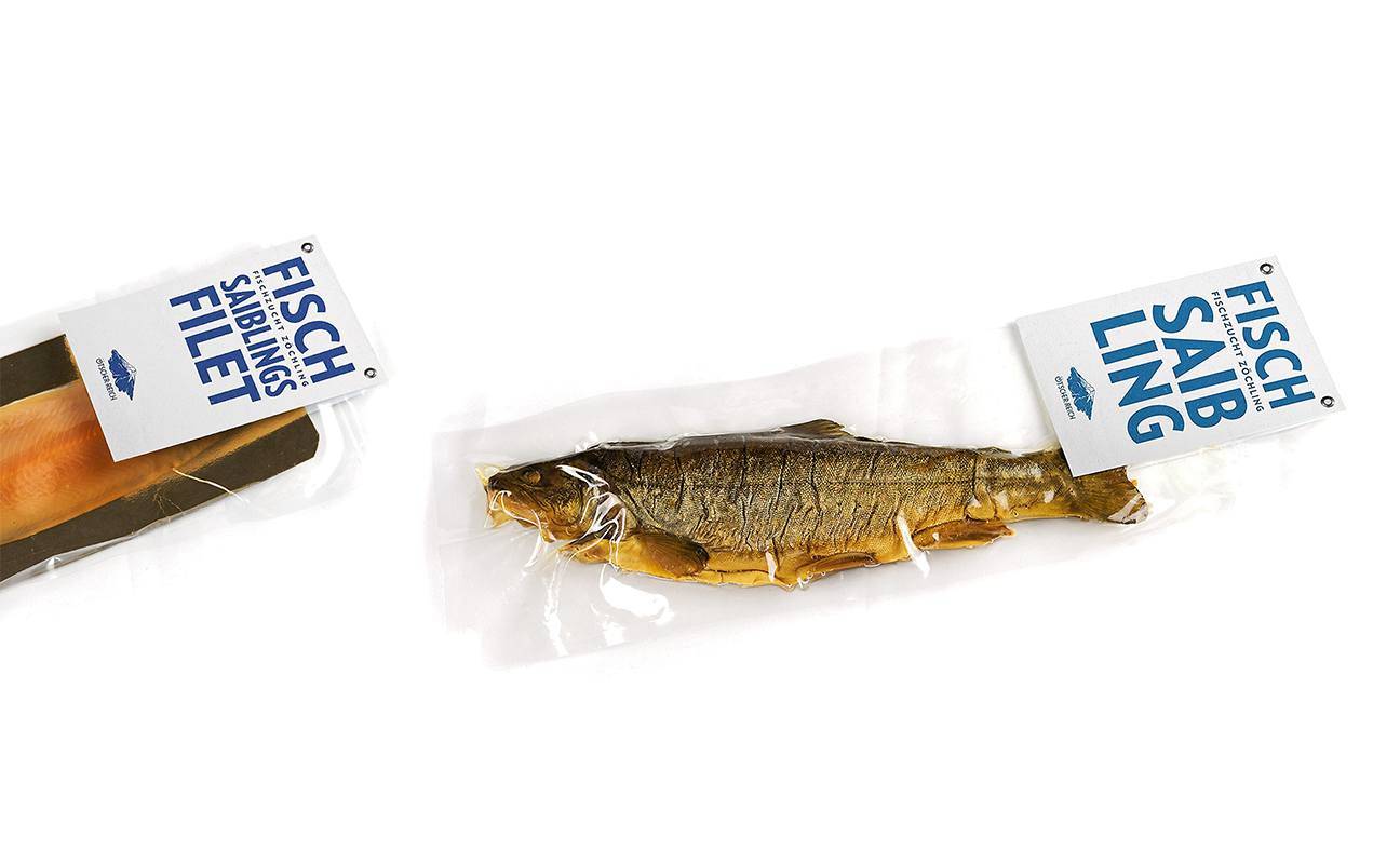
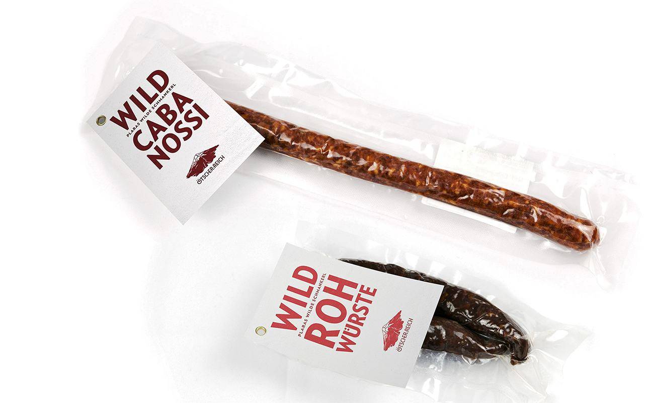
One of the stations is the recently built ötscher basis nature park centre in Wienerbruck, where a restaurant and a shop invites you to indulge the purest pear ciders, elegant wines, specialties from the local bio-fish, venison, wild fruits, or the excellent „erzbräu bergquell“-beer.
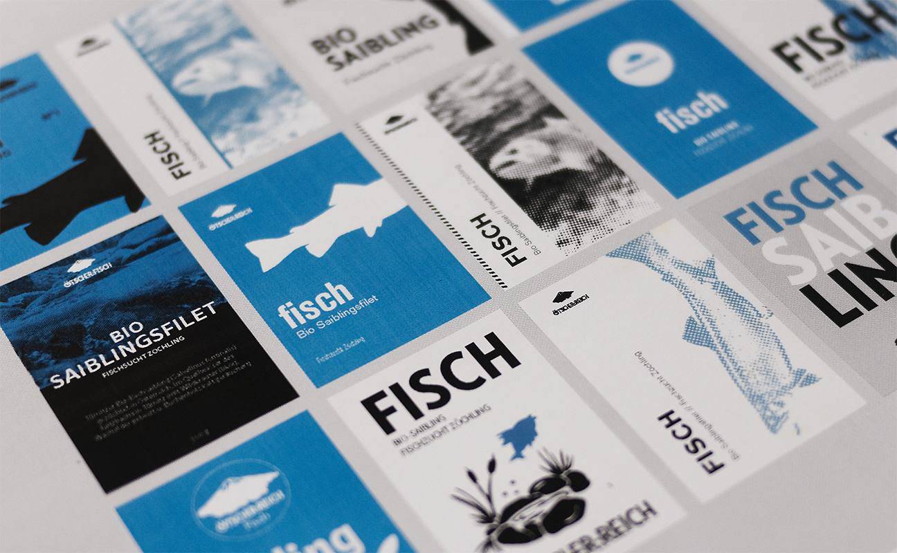
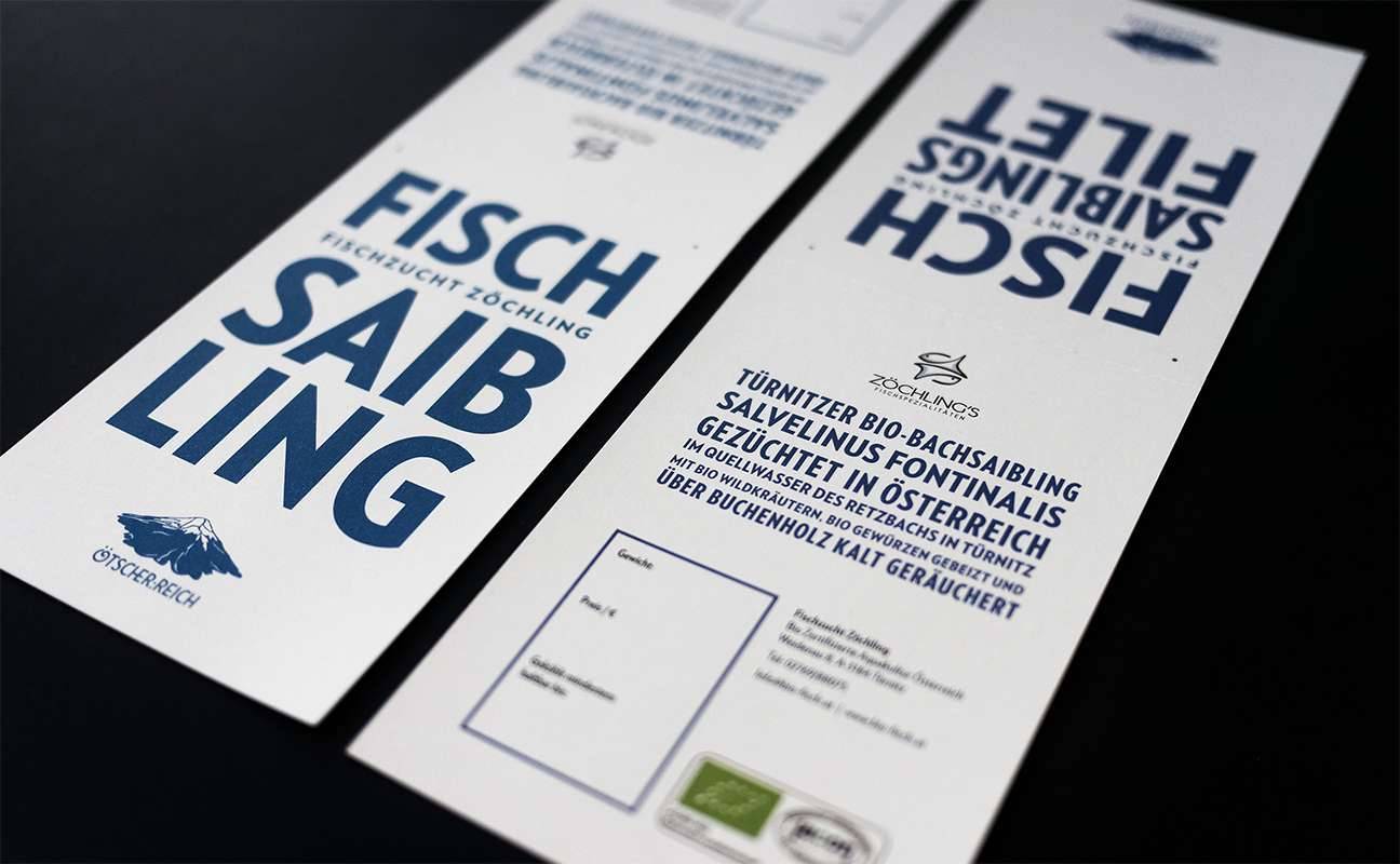
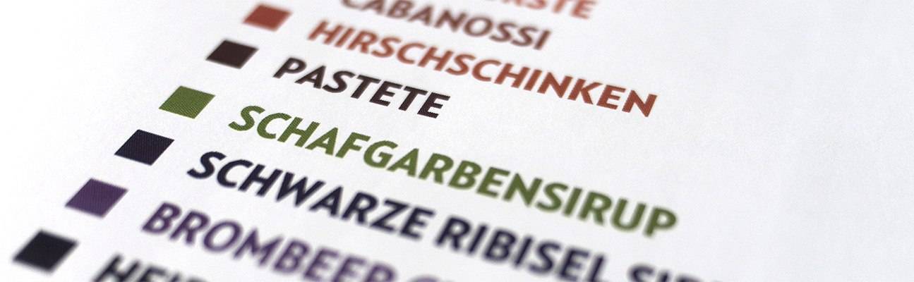
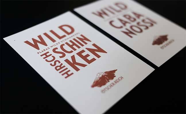
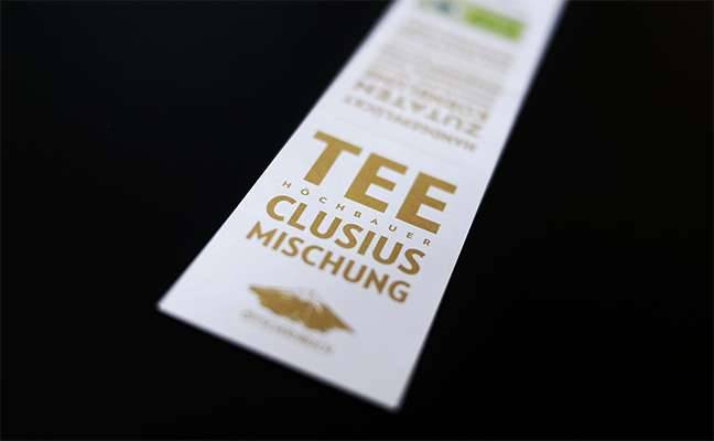
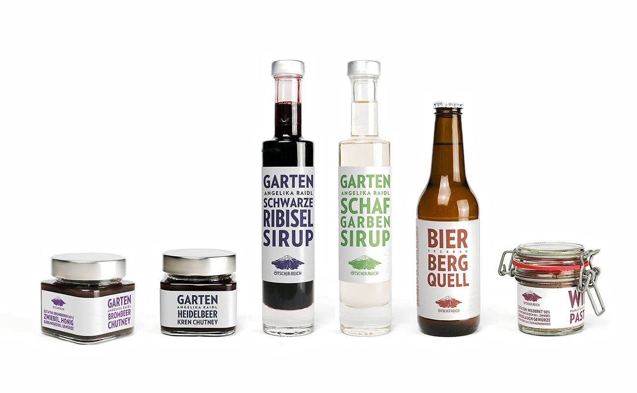
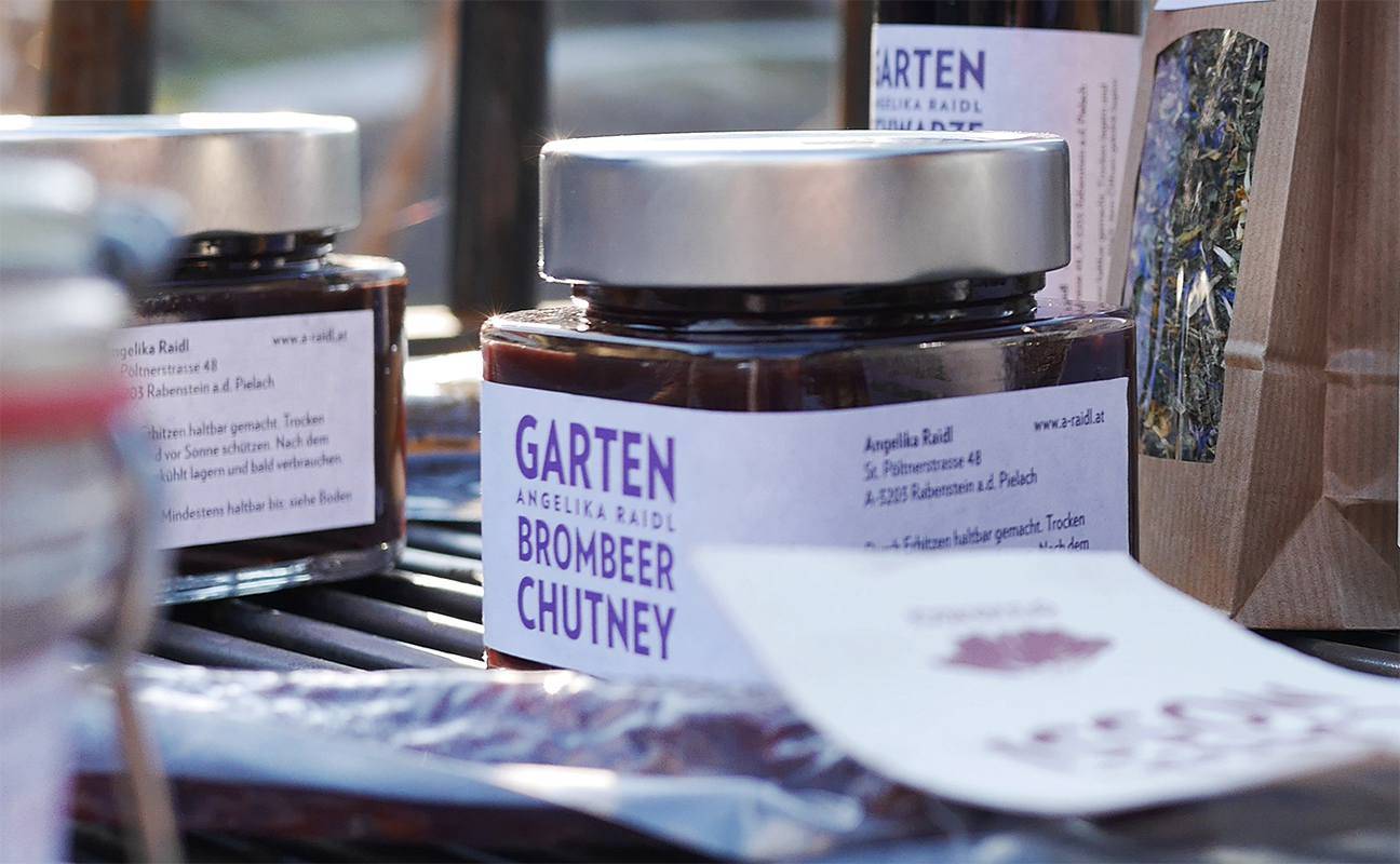
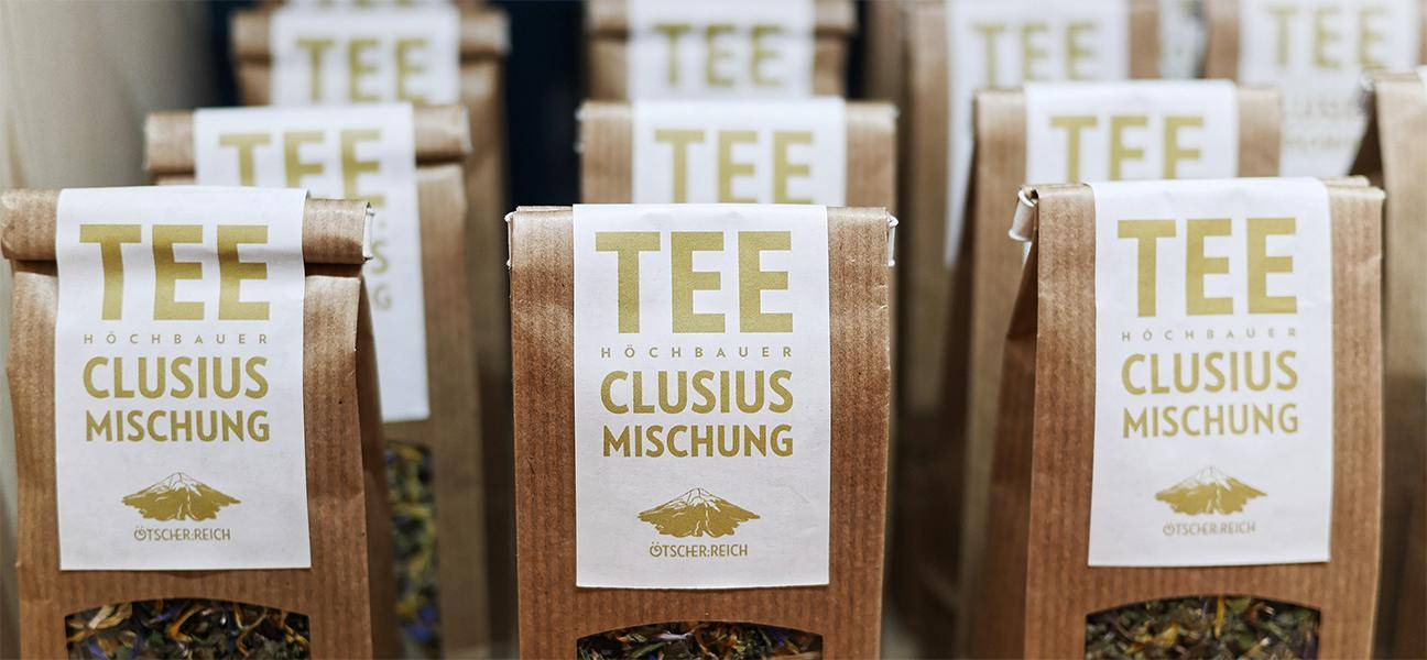
Freiland has designed a series of labels for a number of these locally produced specialties.
This allows the regional producers to present and sell their products at the alpine exhibition under a uniformed Ötscher:Reich-brand.


The Design Process
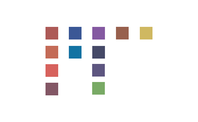
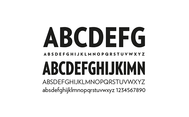
We believe that the focus needs to be on the products, we chose a reduced and simplified typographic solution, where we play with the corporate design typeface from the Ötscher:Reich campaign. alongside the reduced typography we present the products in an harmonically adjusted colour palette that also divides the product series in categories. A visit to the alpine exhibition is absolutely worth your while!