

Arkitektenes fagforbund - Redesign of logo and visual identity
Type: Branding, Corporate Design, Illustration, Webdesign
Services: Concept, Art Direction
Realized: 2018
Industry: Organisation, Architecture, Union
Client: Arkitektenes fagforbund
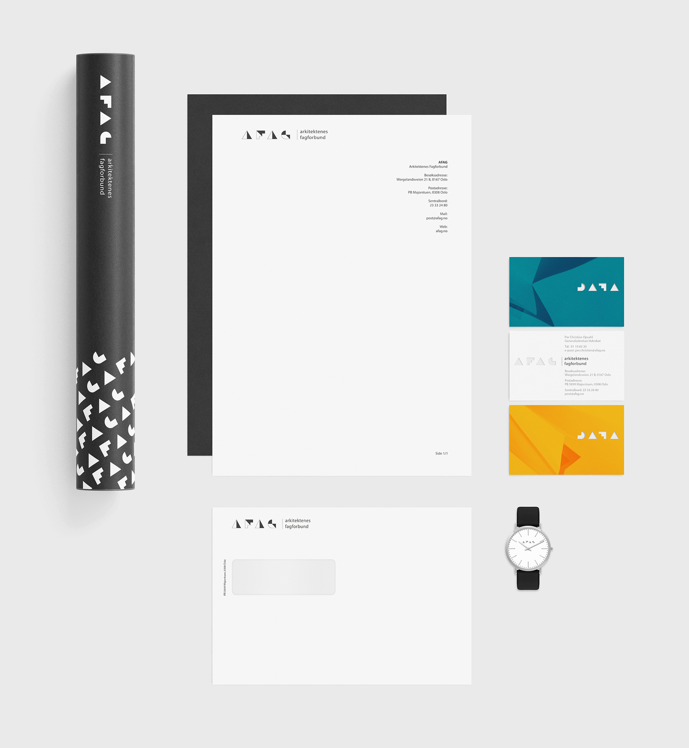
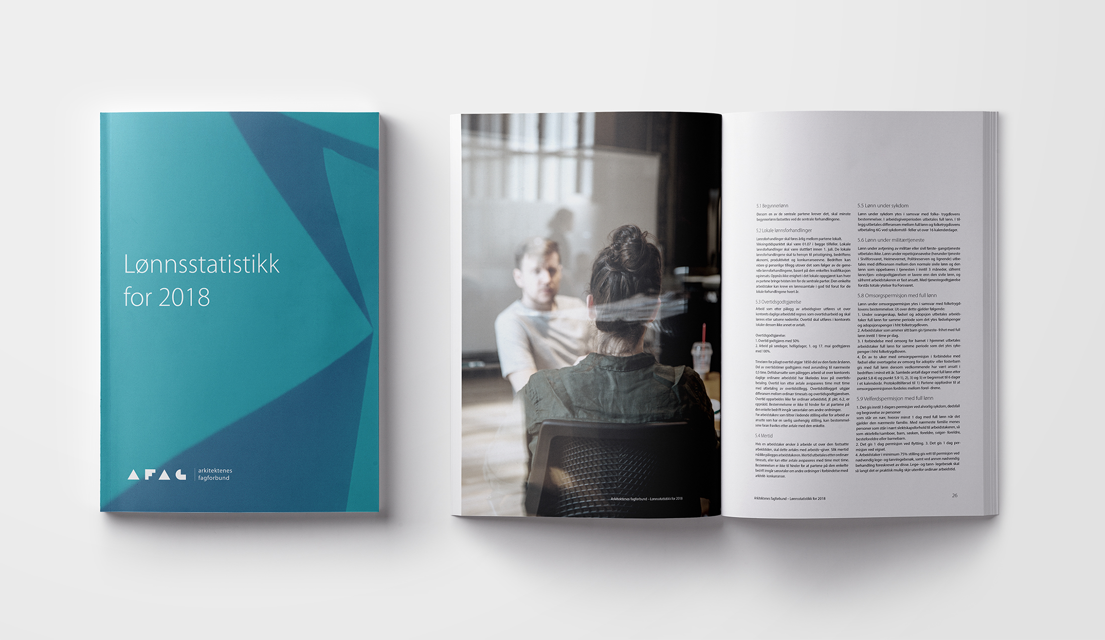
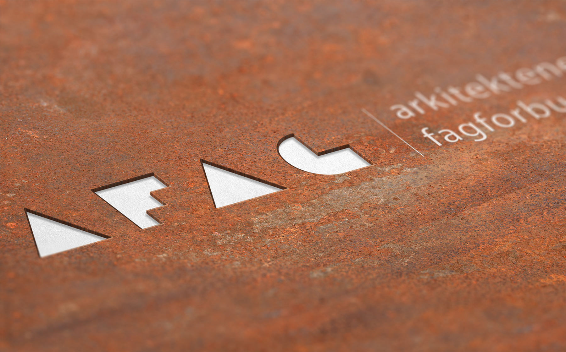
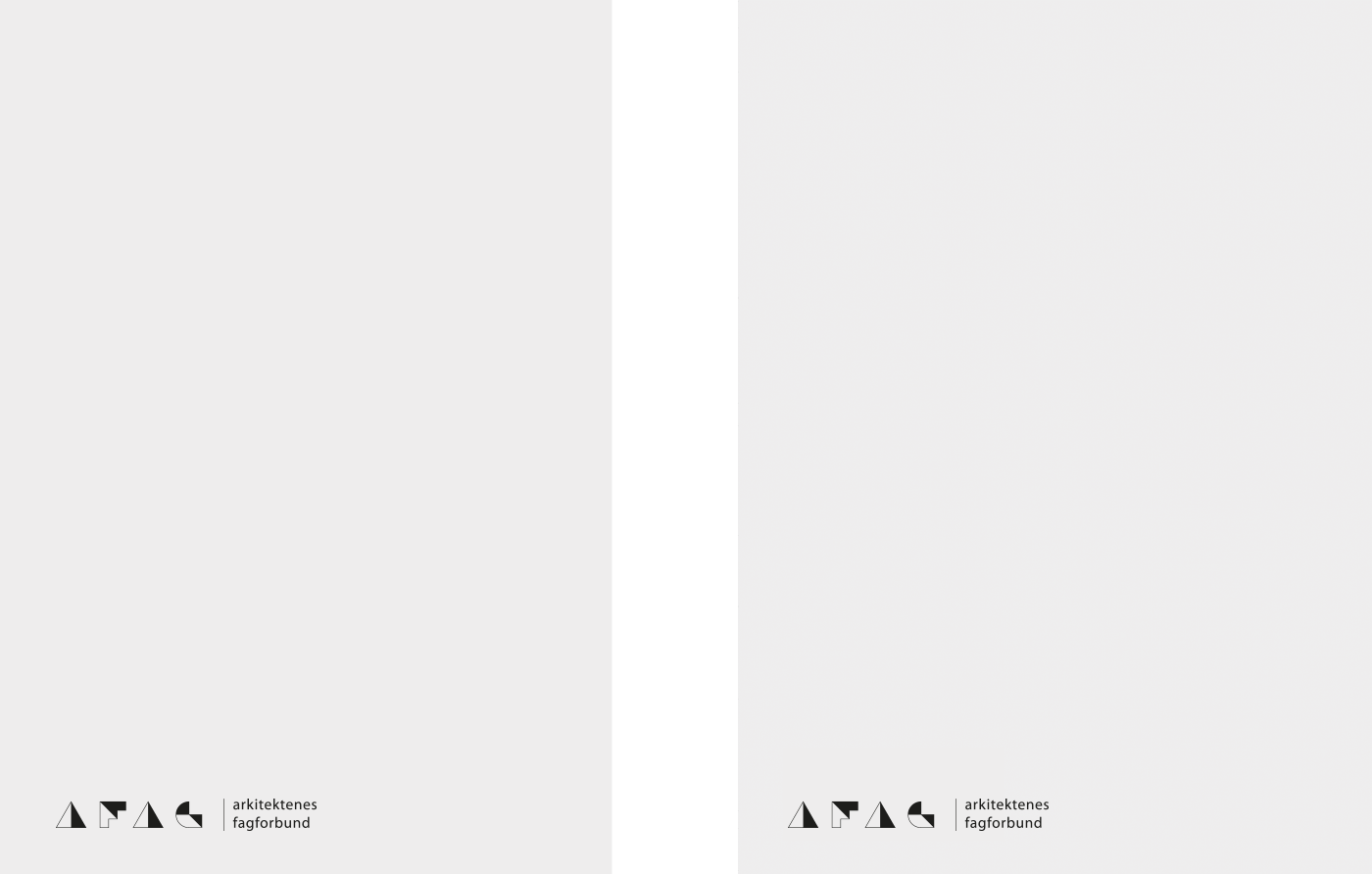
The logo is based on simple play with paper and geometry. By cutting and folding paper, we constructed the letters AFAG. The shapes formed by the mixture of hard and soft shadows cast from the folded bits of paper together with the negative space create interesting ‘architectural’ elements. These structures we have later on used as abstract design elements in the visual identity.
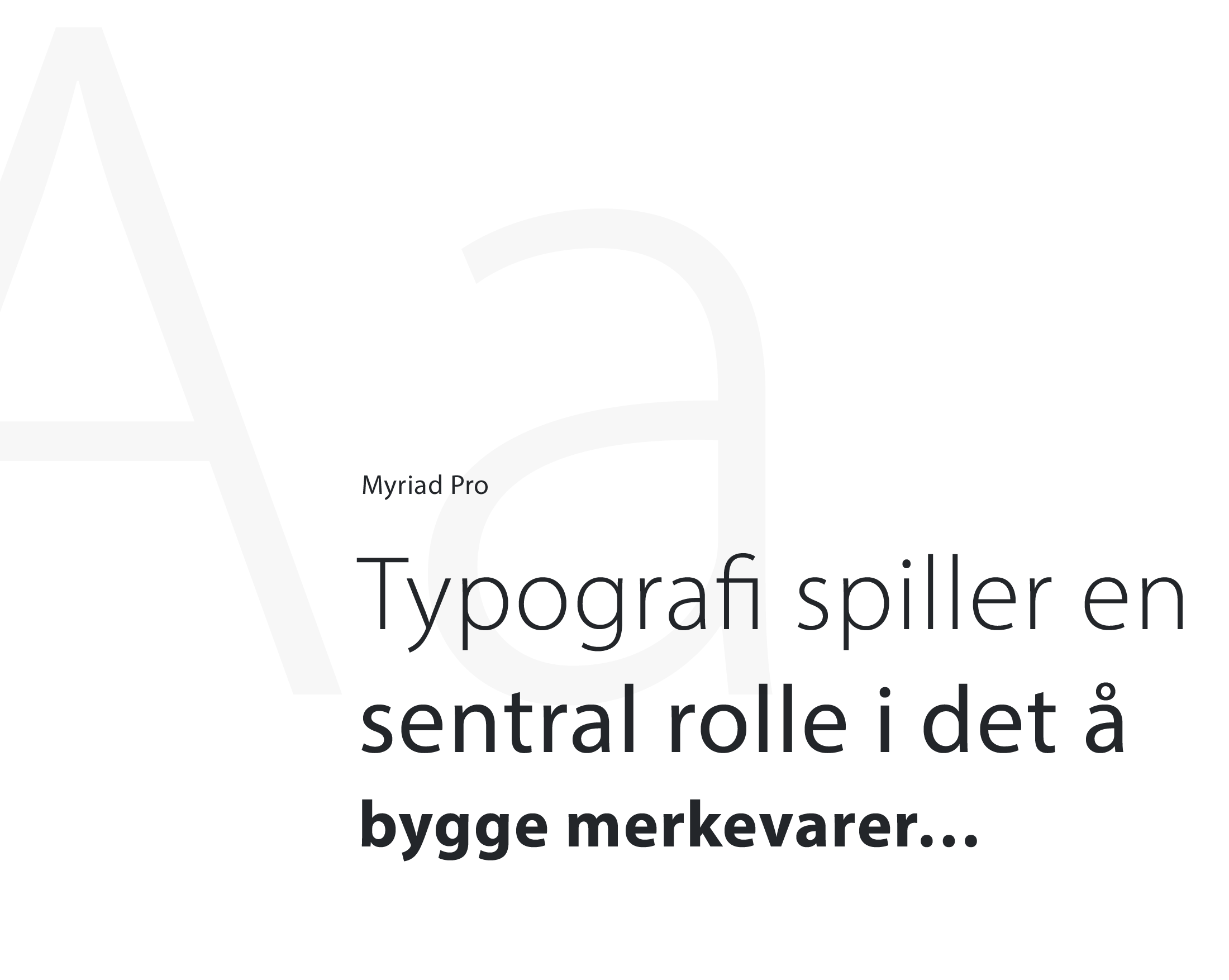
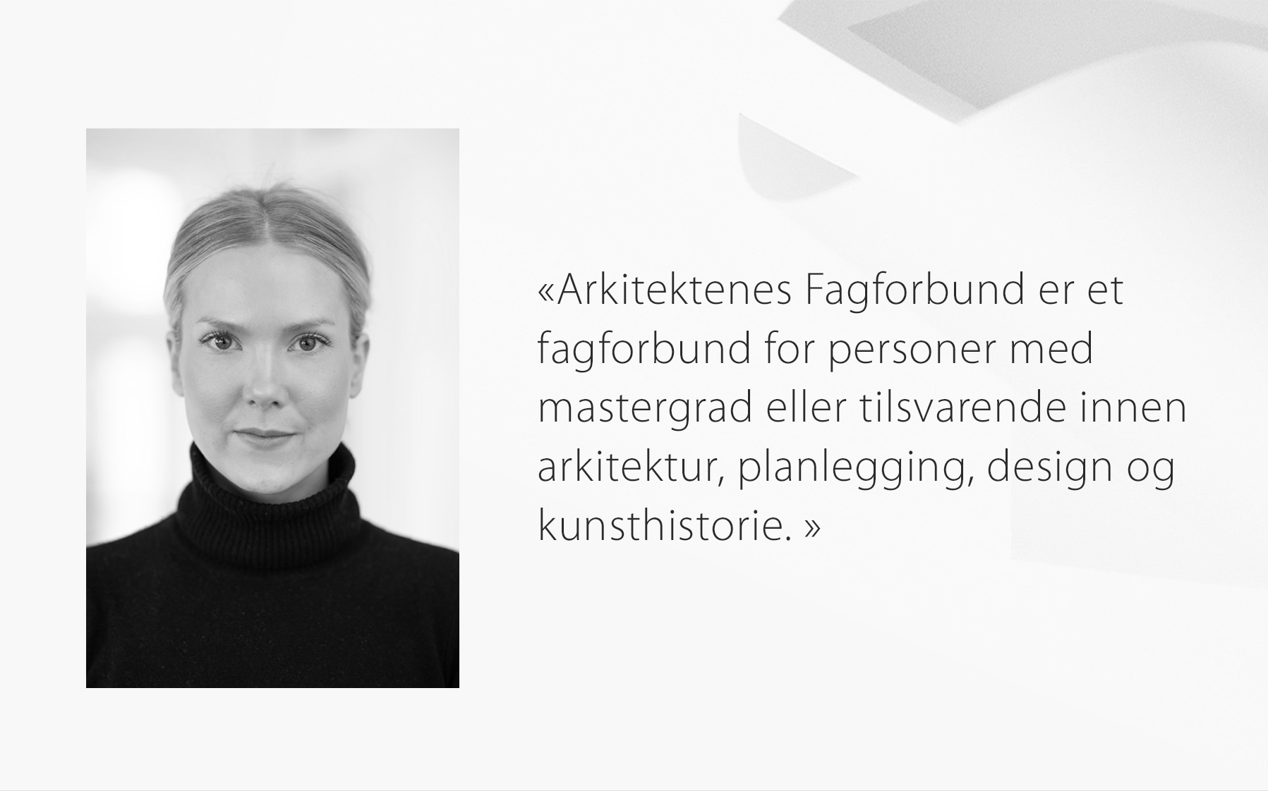
We chose the typeface Myriad Pro for its typographic clarity in form of legibility and readability. The typeface comes in many weights and the typographic image appears modern and light, something that suited the shadow-theme of the visual identity well.
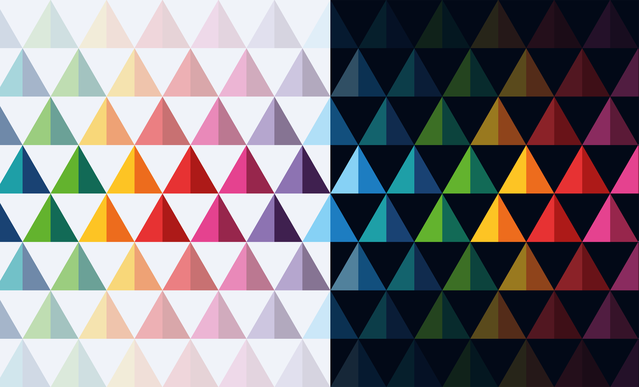
To go with the serious typeface, we chose a wide range of colours that were paired and assigned to the many fields AFAG work with in their daily operation.
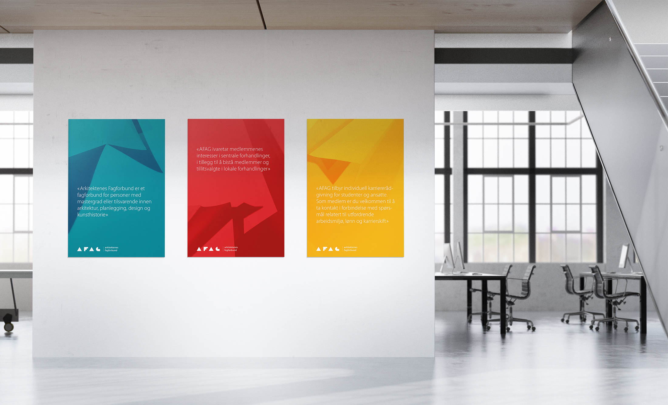
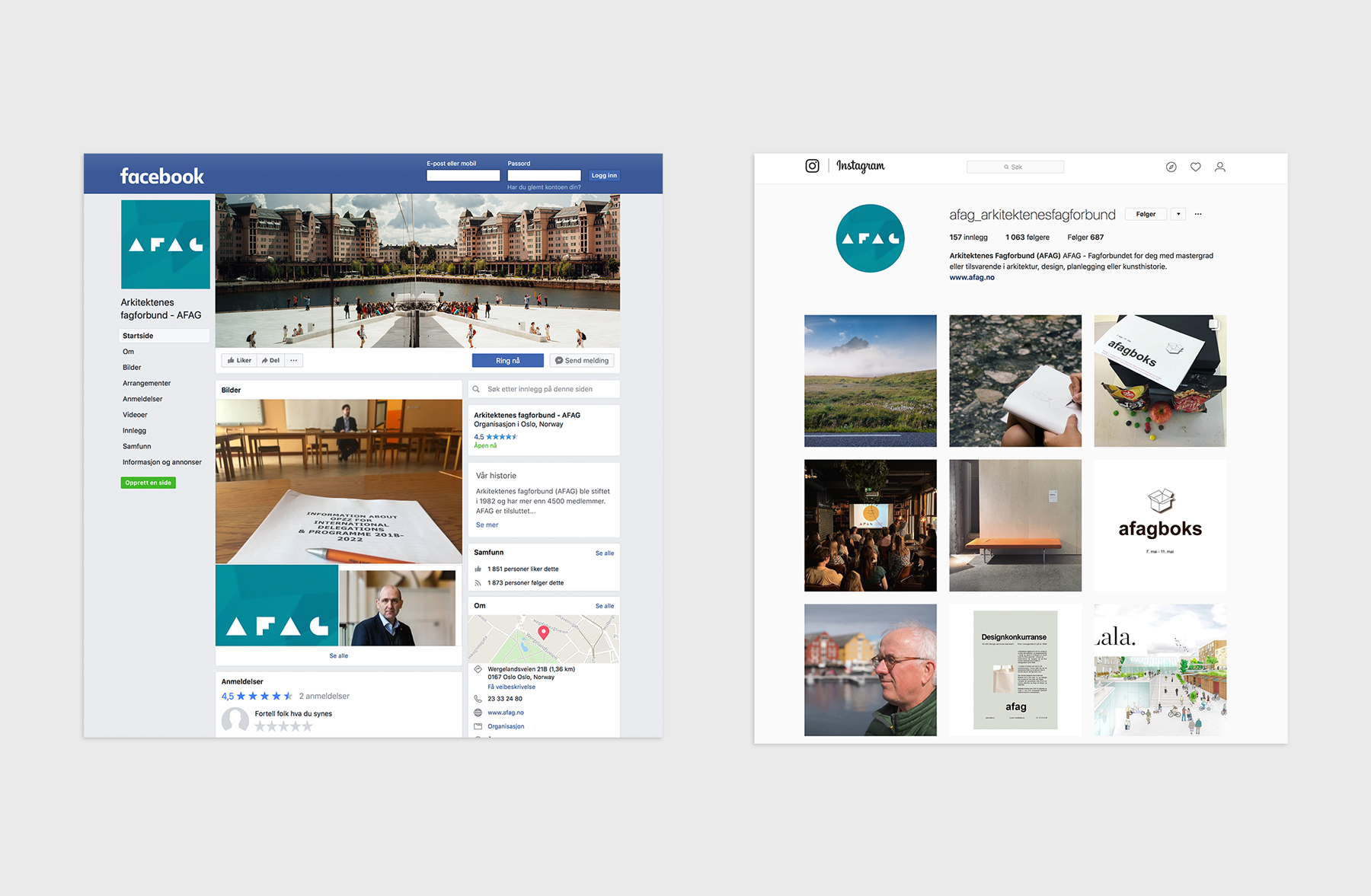
Based on the simple idea of folded geometric shapes, we created an alphabet that can be used to convey simple messages on social media, or printed as greeting cards.