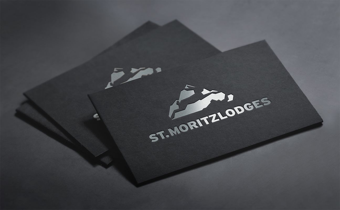
St. Moritz Lodges Logo Design
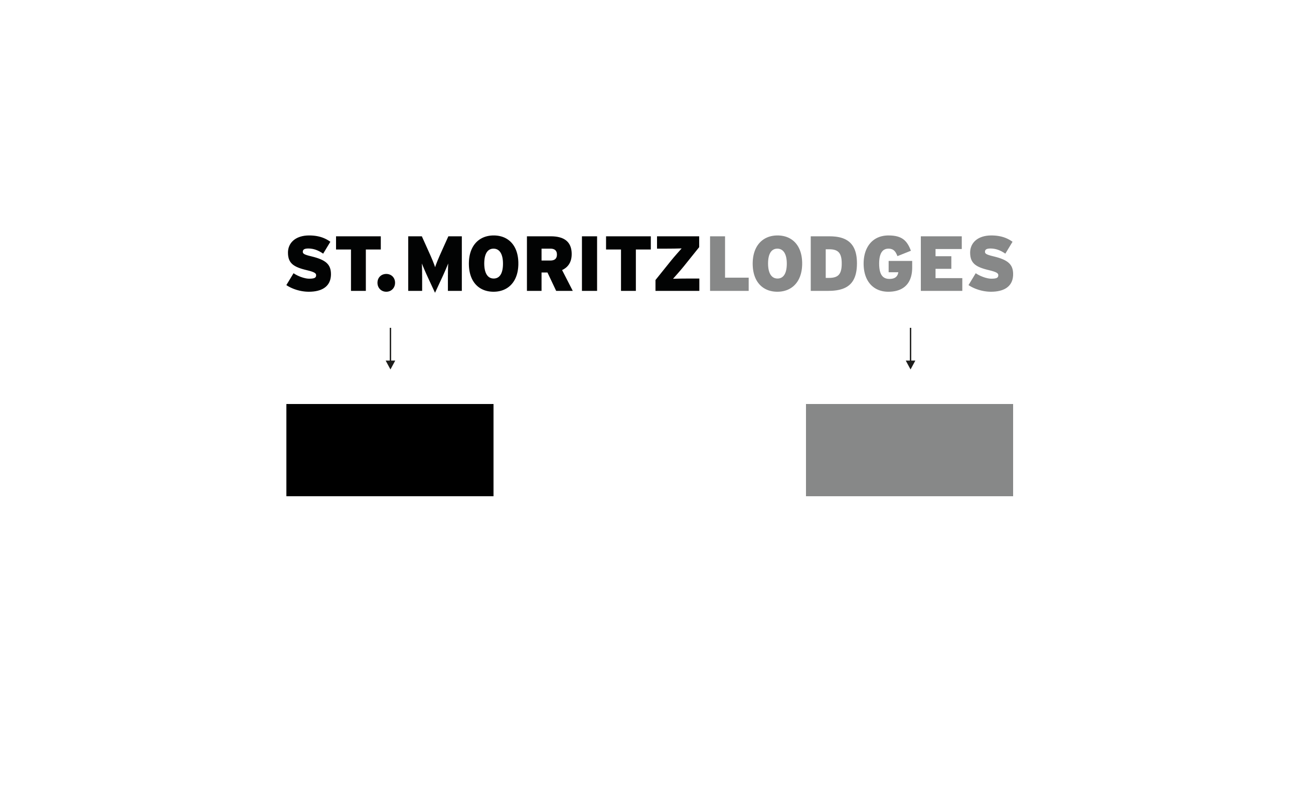
In 2012 we designed the logo for „Rheinproperty“ and „Kitzbühel lodges“ a exclusive vacation rental service of the Rheinproperty-Group. We were asked to create a logo design for the second branch, St. Moritz Lodges in Switzerland. Our starting point was: same font, same color, same style.
How should it look like, and what could symbolise St. Moritz?
Type: Concept, Corporate Design
Services: Logo Design, Stationary Design
Realized: March 2015
Industry: Tourism
Client: Rhein Property GmbH

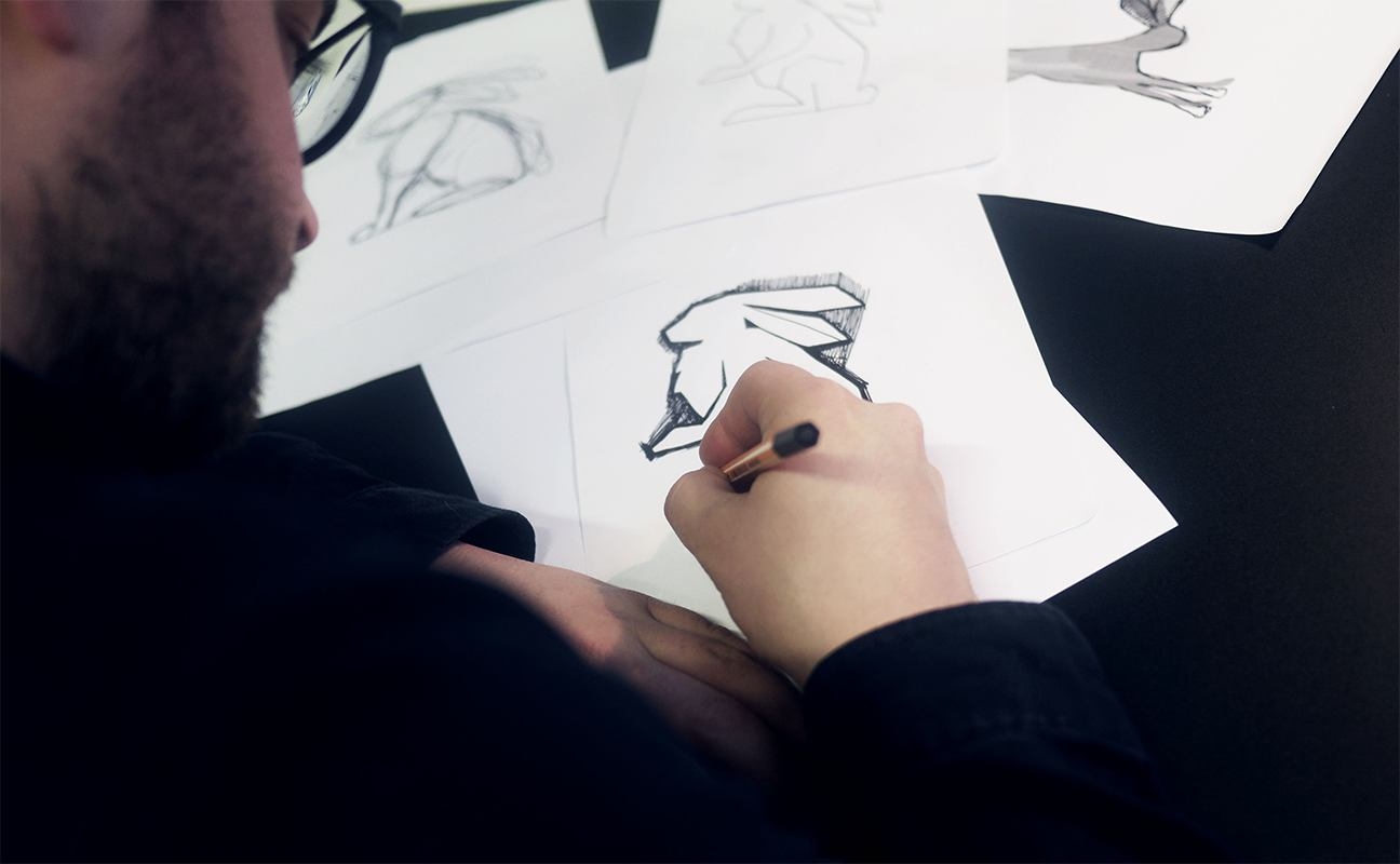
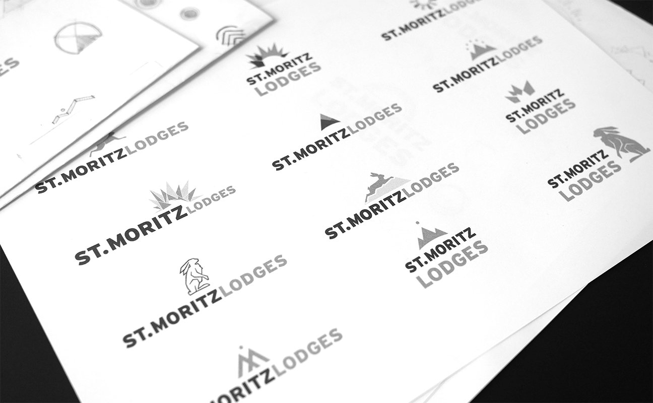
In process
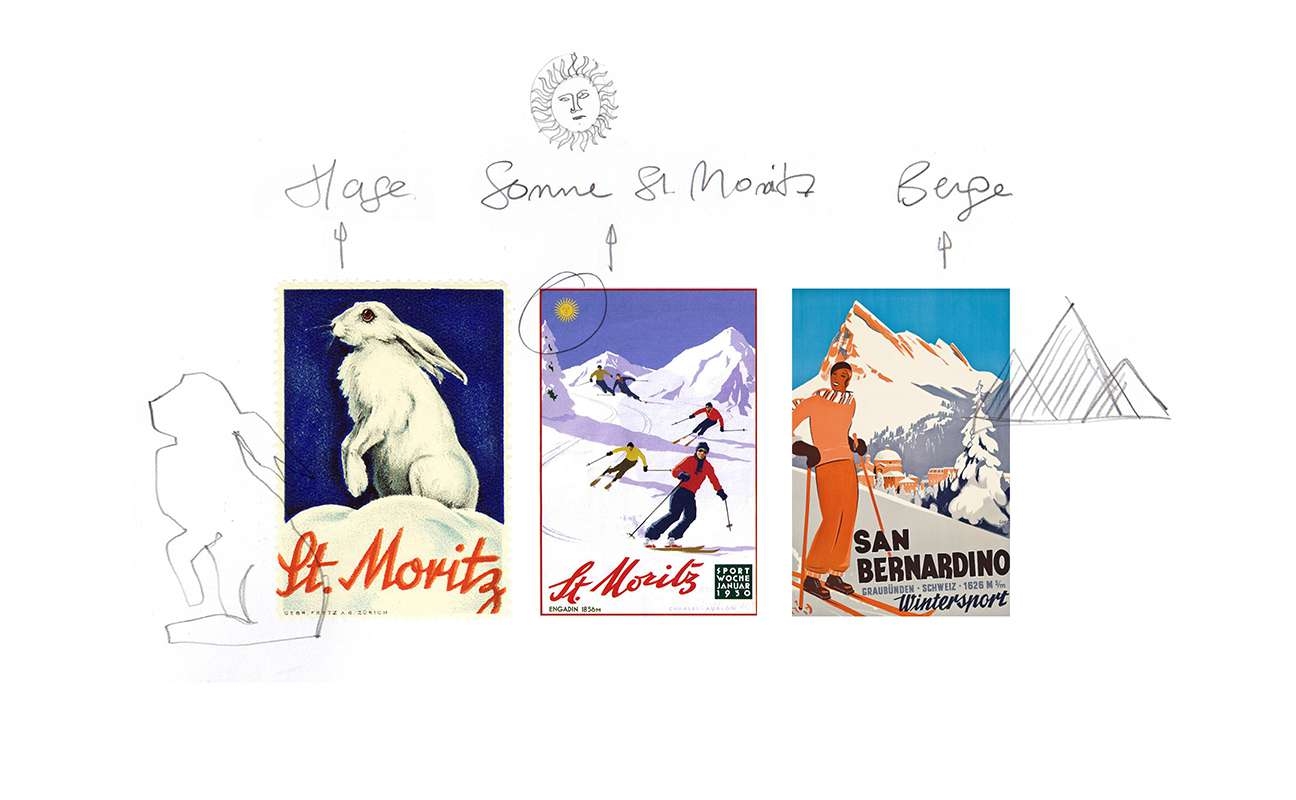
The hare, the sun and the mountains.
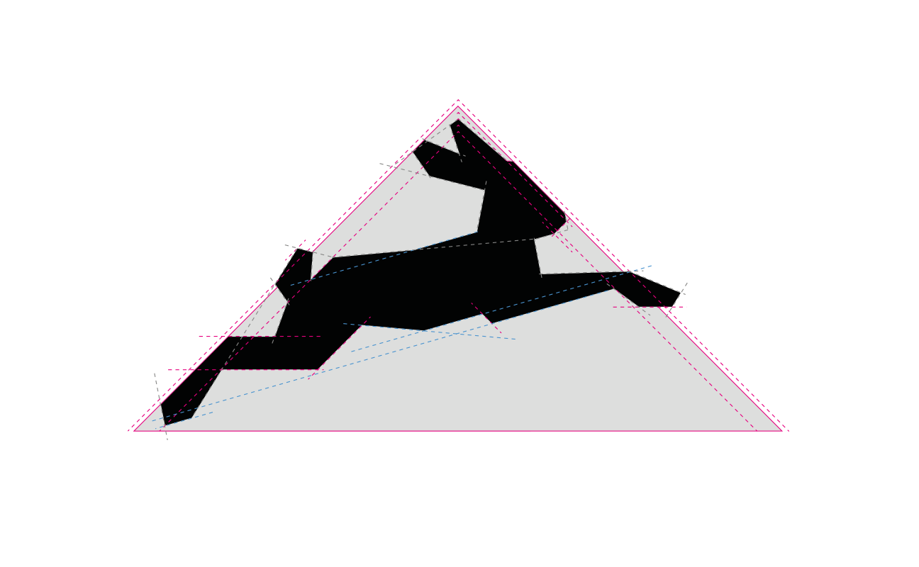
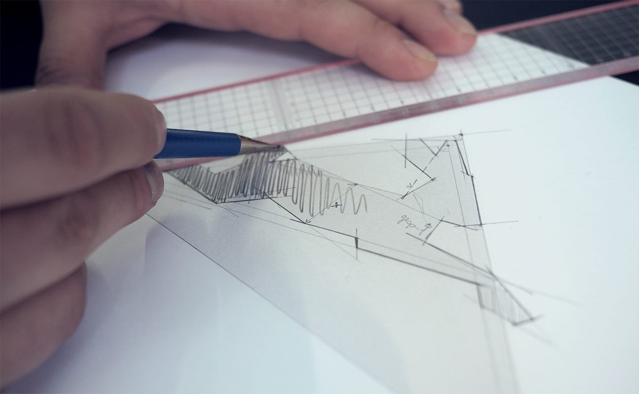
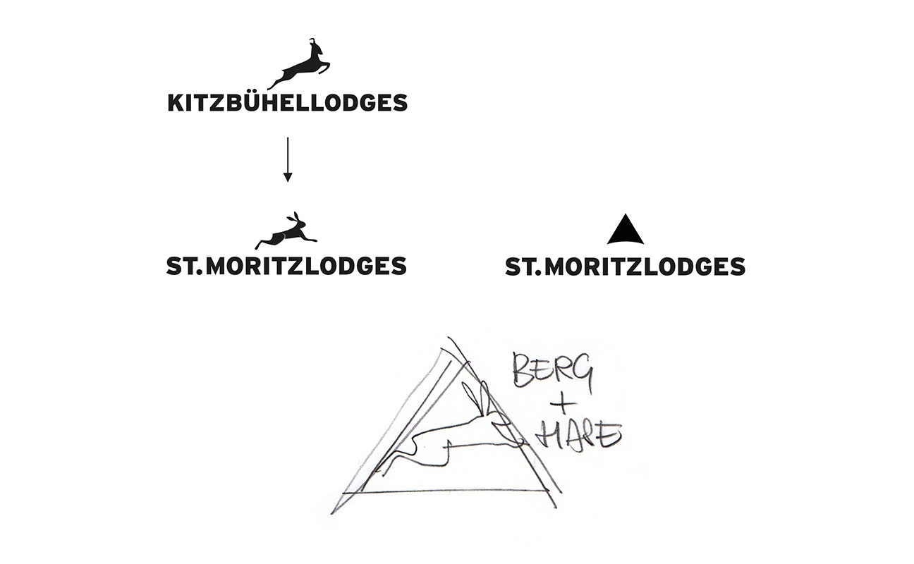
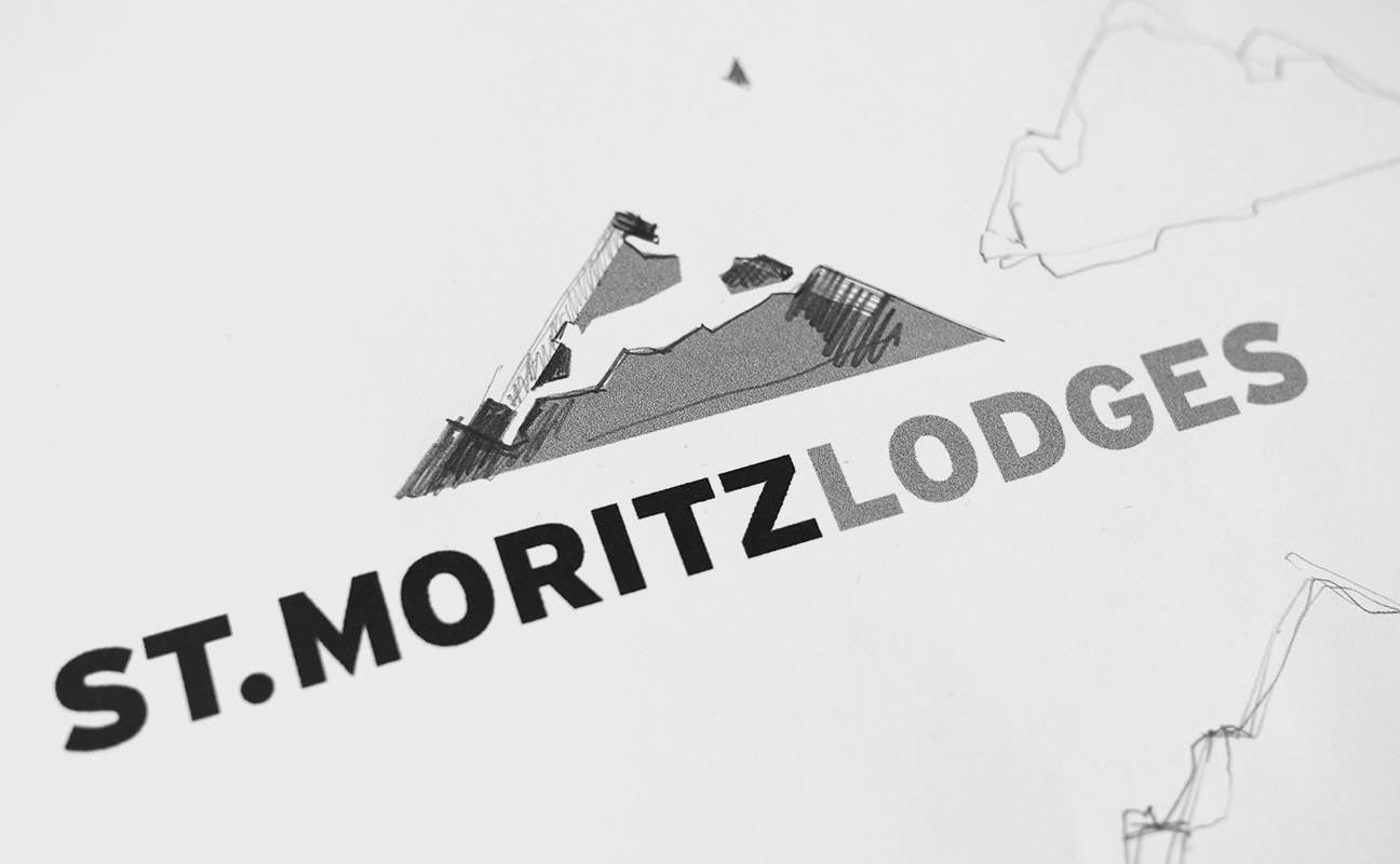
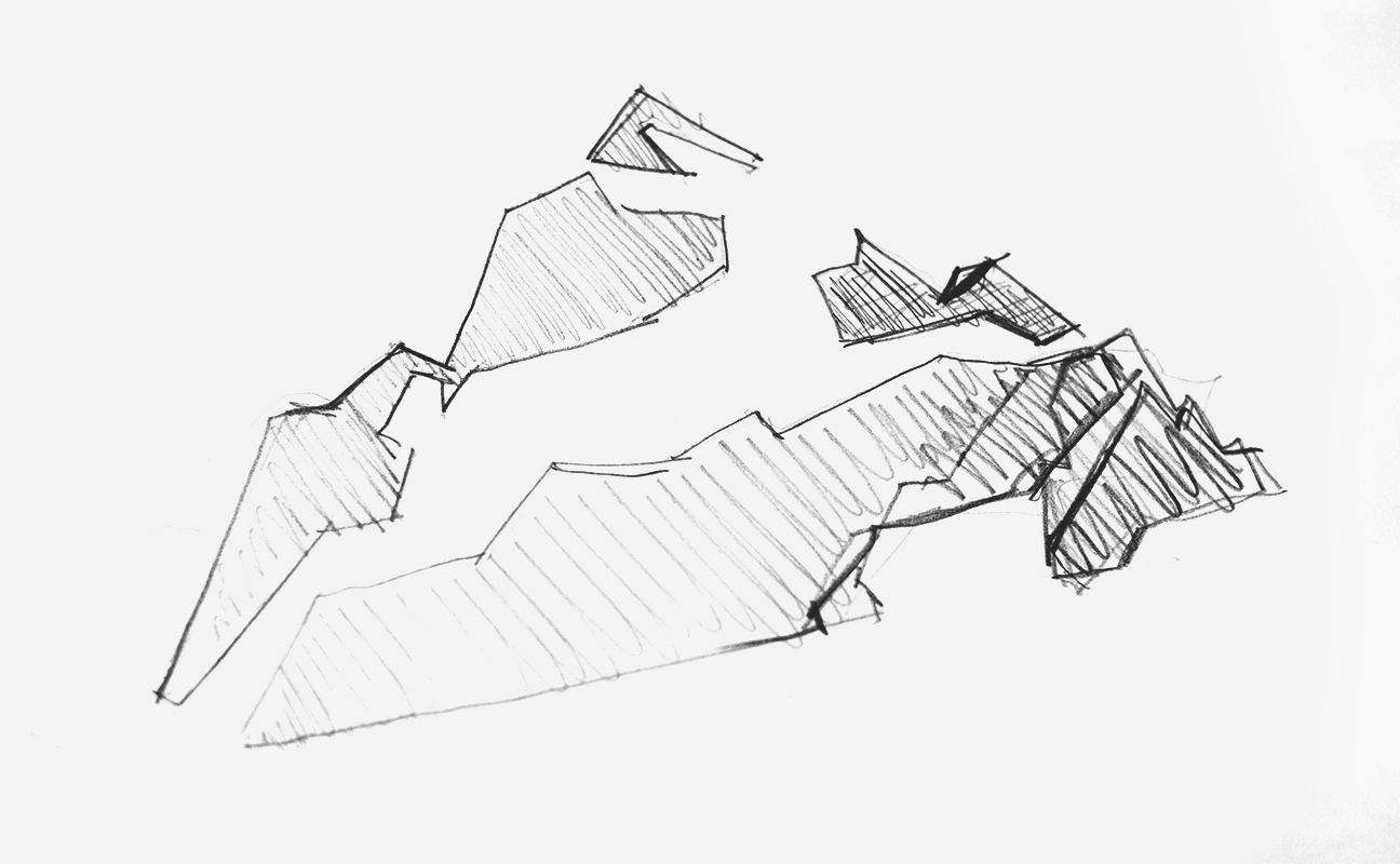
They are all symbols that can be connected to St. Moritz and thats where we started with our first sketches. The process ended up with combining the hare and the mountain in the style of the ram from the Kitzbühel Lodges.
Reshape
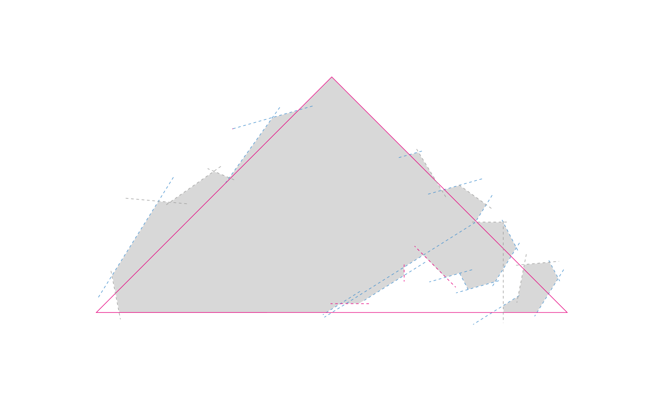
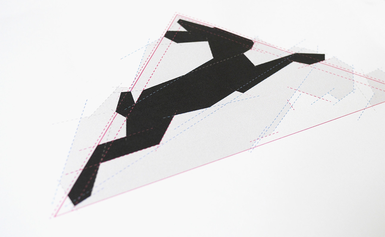
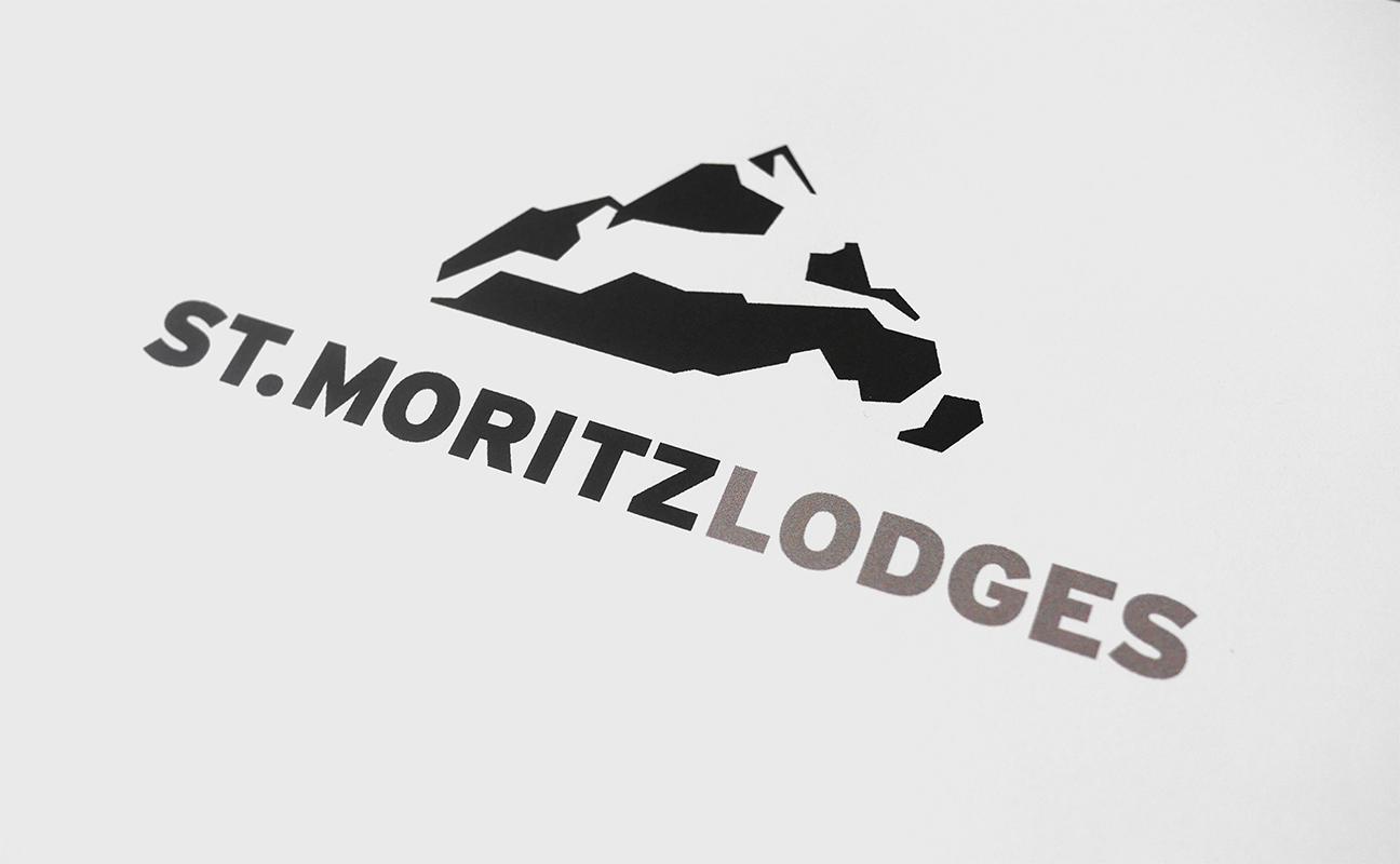
We merged the hare with a triangle and styled it to resemble a rugged mountain with an intricate system of parallel lines, relating angles.
The shape of the hare comes to life in the shadow/snowy parts of the mountain
