Power Box Corporate Design
Power Box, a brand new kind of fast food. Low-fat, healthy and above all tasty. It all started with a mobile Power Box in Viennas 12th district and recently a new restaurant opened in Viennas 6th district.
Our first job was the complete rework of the old logo and the creation of an entire corporate design.
Type: Corporate Identity
Services: Corporate Design, Logo Design
Realized: December 2014
Industry: Gastronomy, Food
Client: Power Box E.U. Wien
Back to the basics
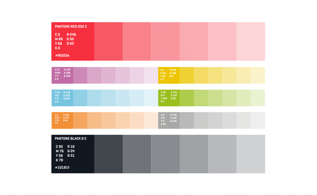
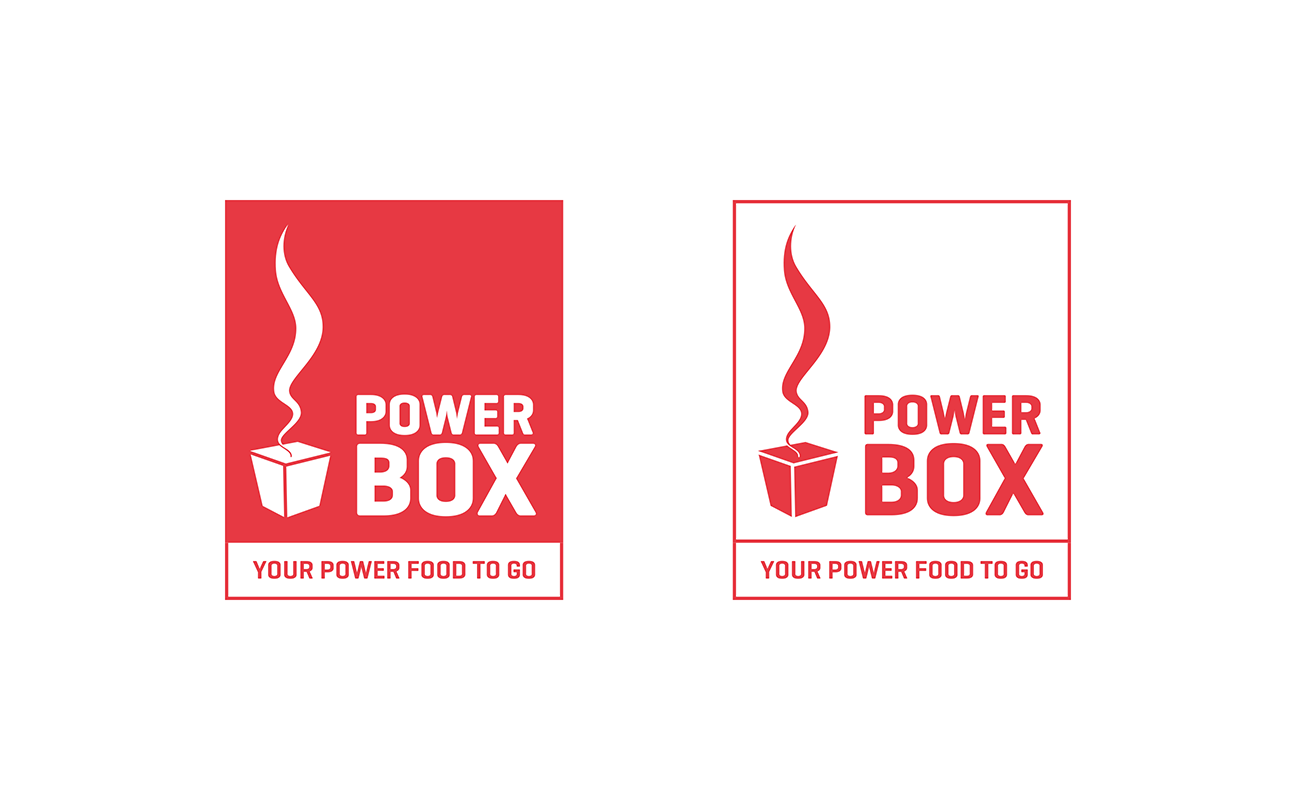
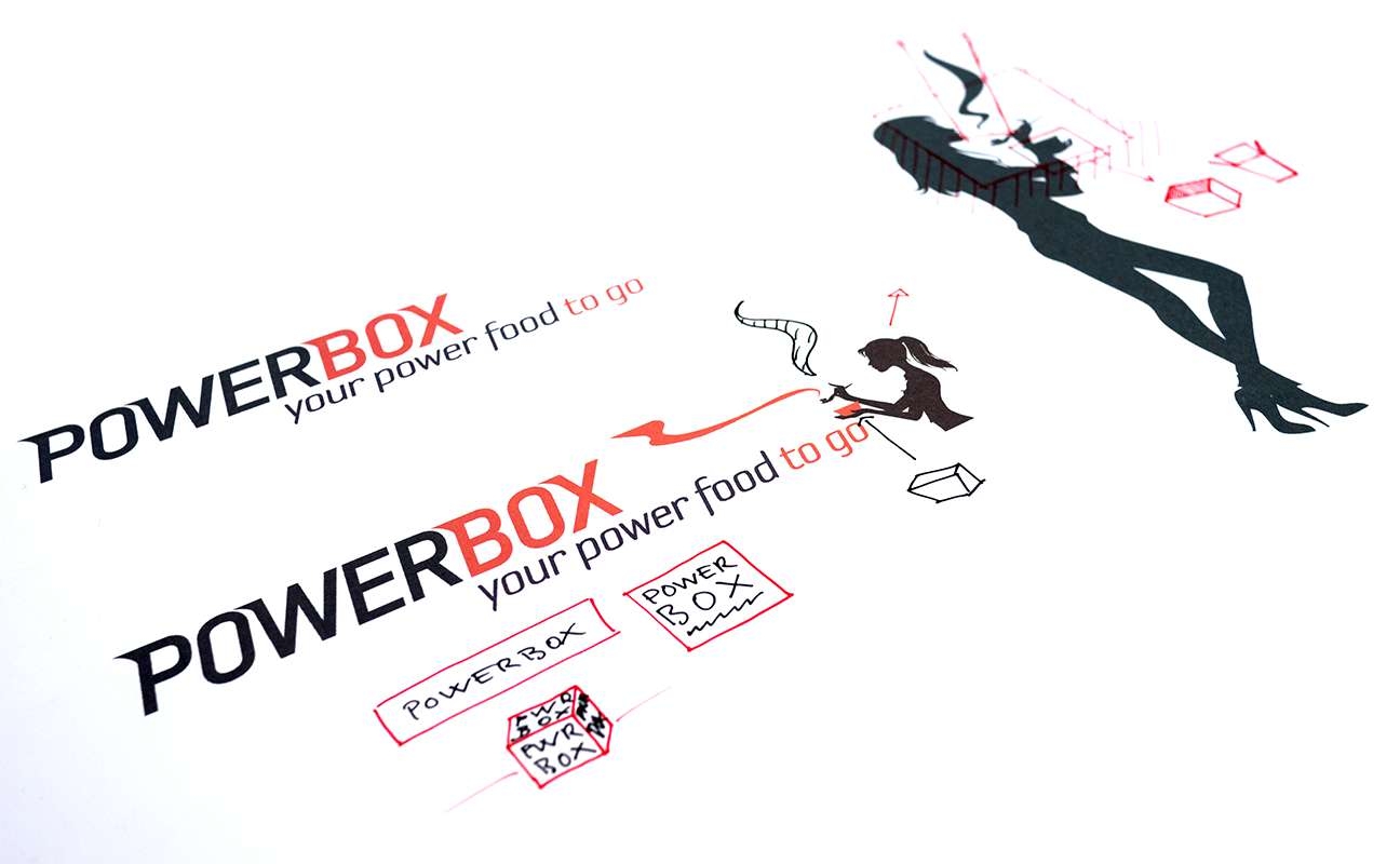
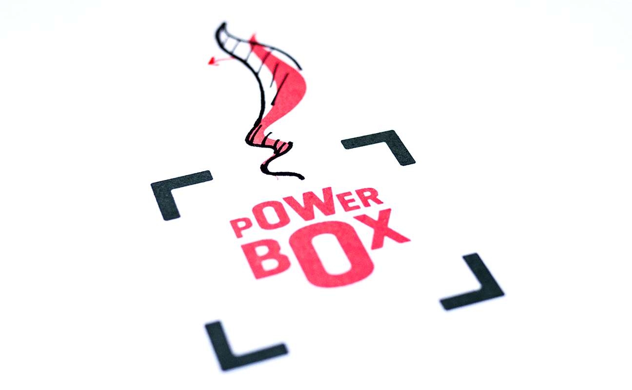
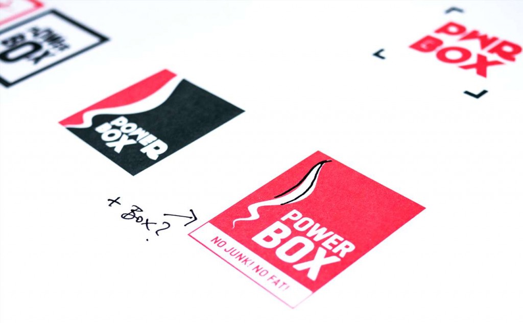
Except from keeping the red color we completely re-worked the logo (even the red was tweaked for added freshness).
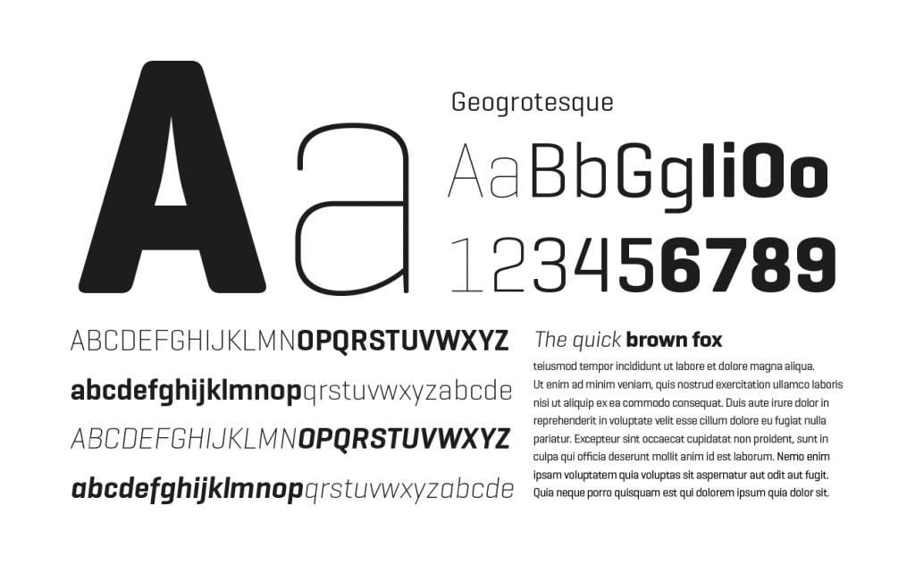
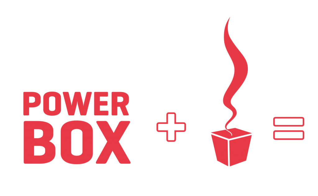
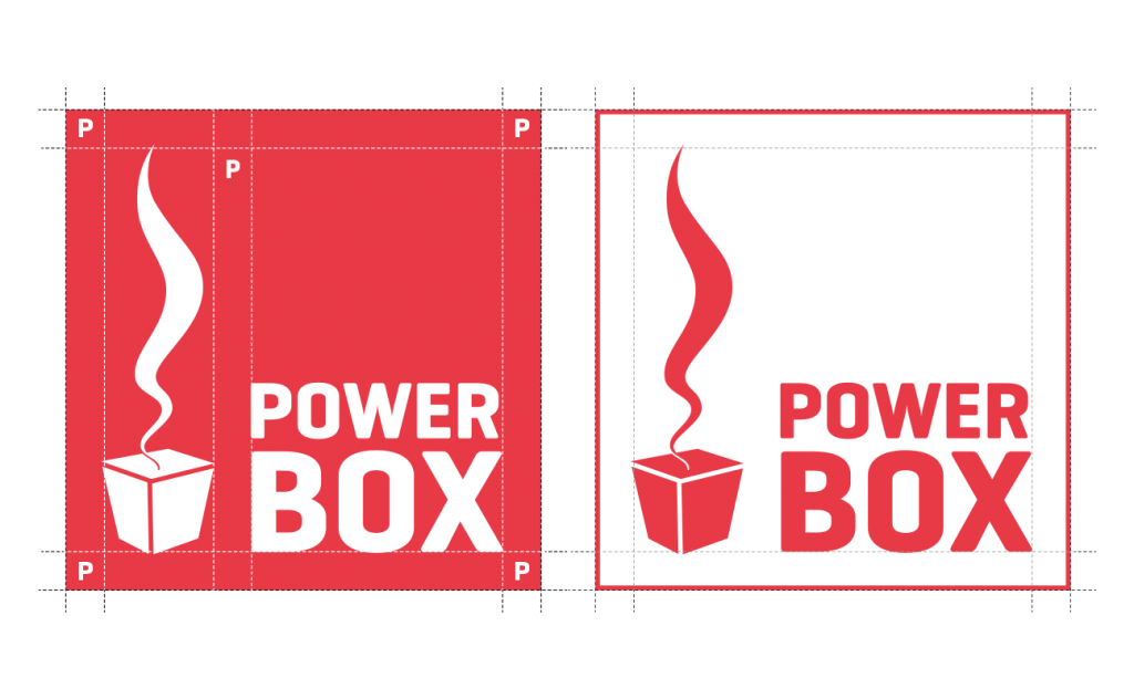
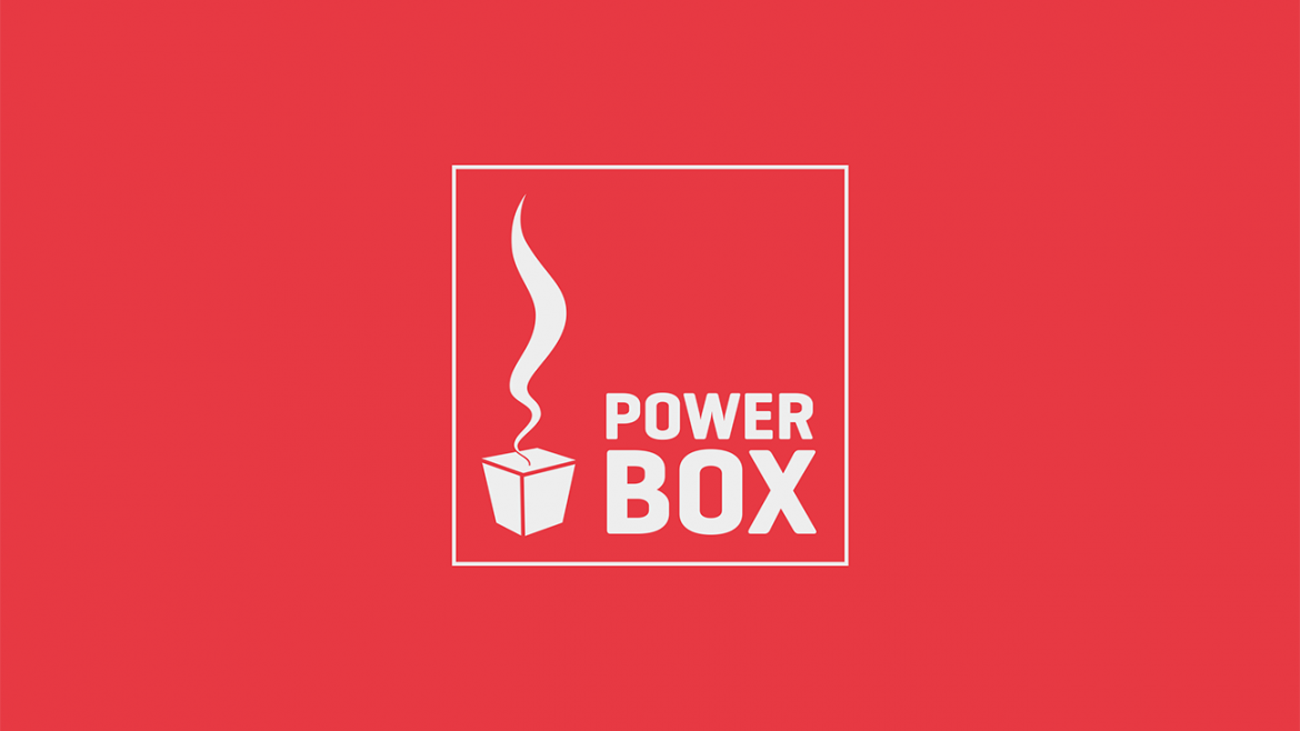
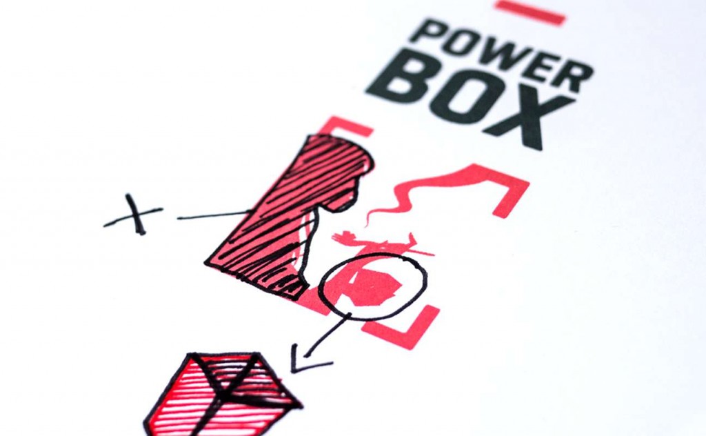
A box is a box. Therefore the new logo is also a square. Following this string of thoughts, also the word-mark „Power Box“ was broken into two lines. Equally powerful as the red, a reminiscence of sport brands, our chosen font was the Geogrotesque from the Barcelona based Emtype.
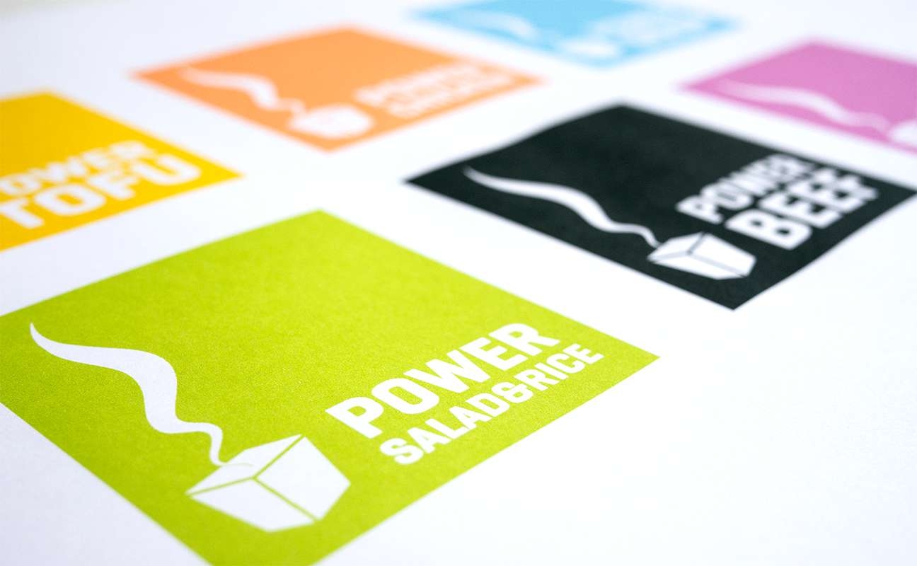
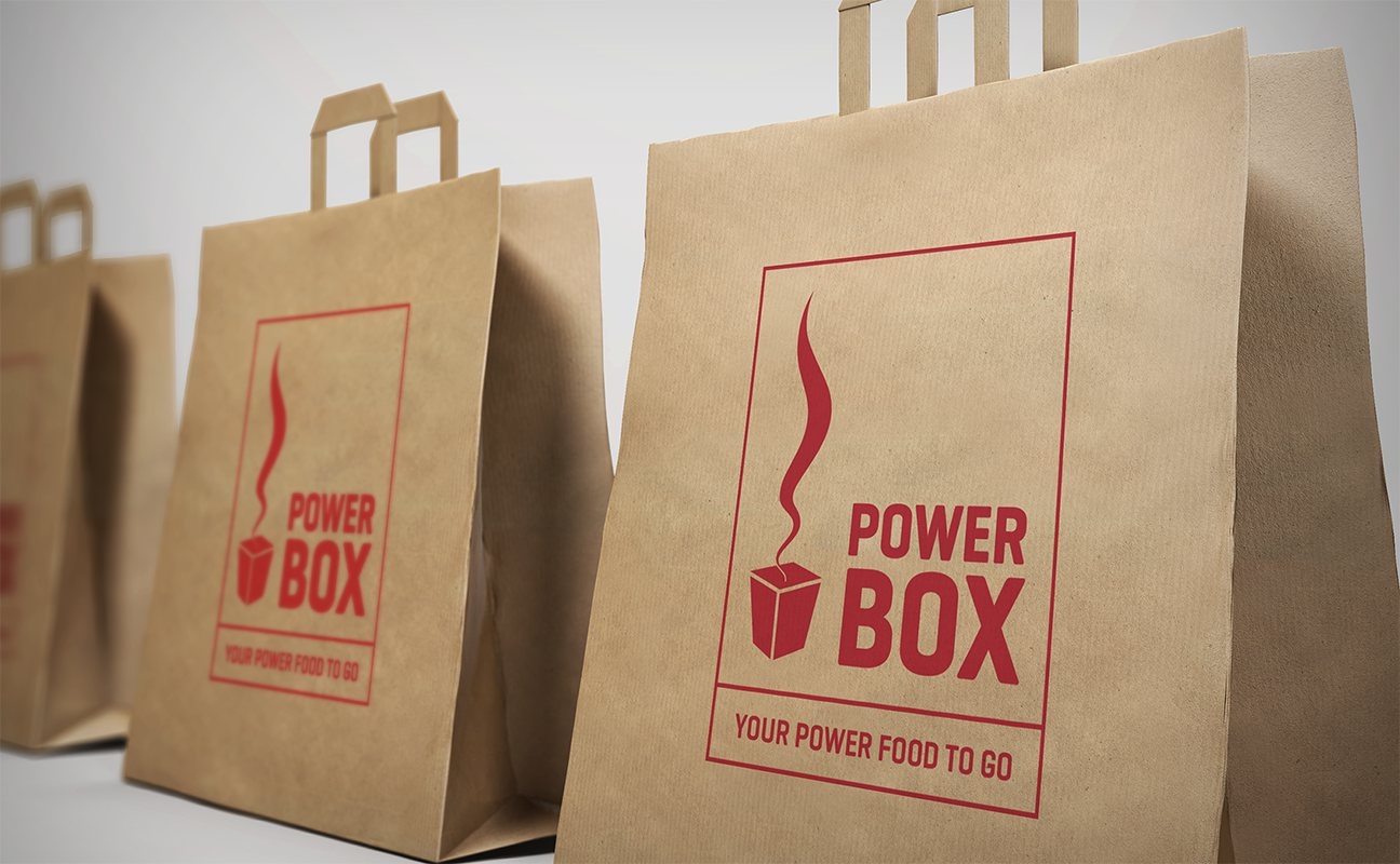
Following the franchise idea of the Power Box system, it was all about developing a logo and a corporate design, that would work anywhere and in any form. Negative, black & white, on a a bag, or as a neon sign.
