AFAG
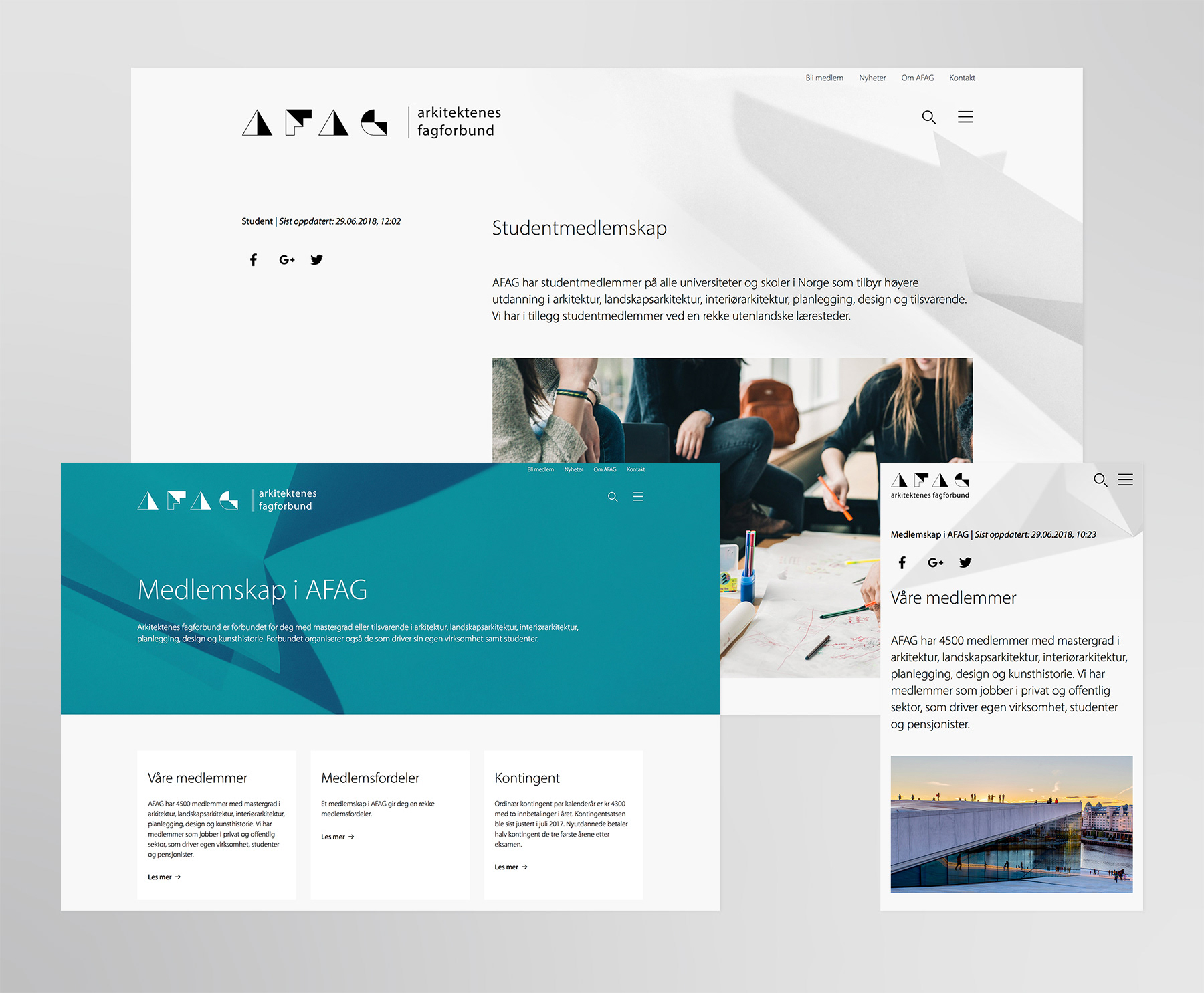
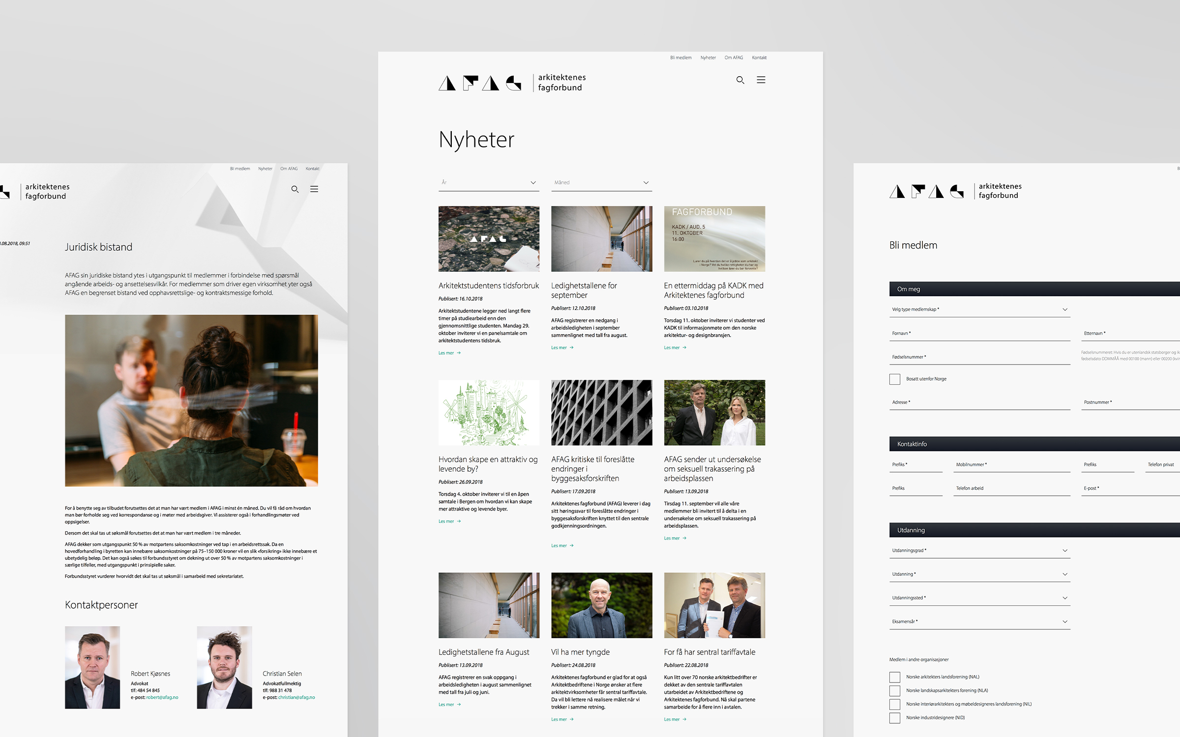
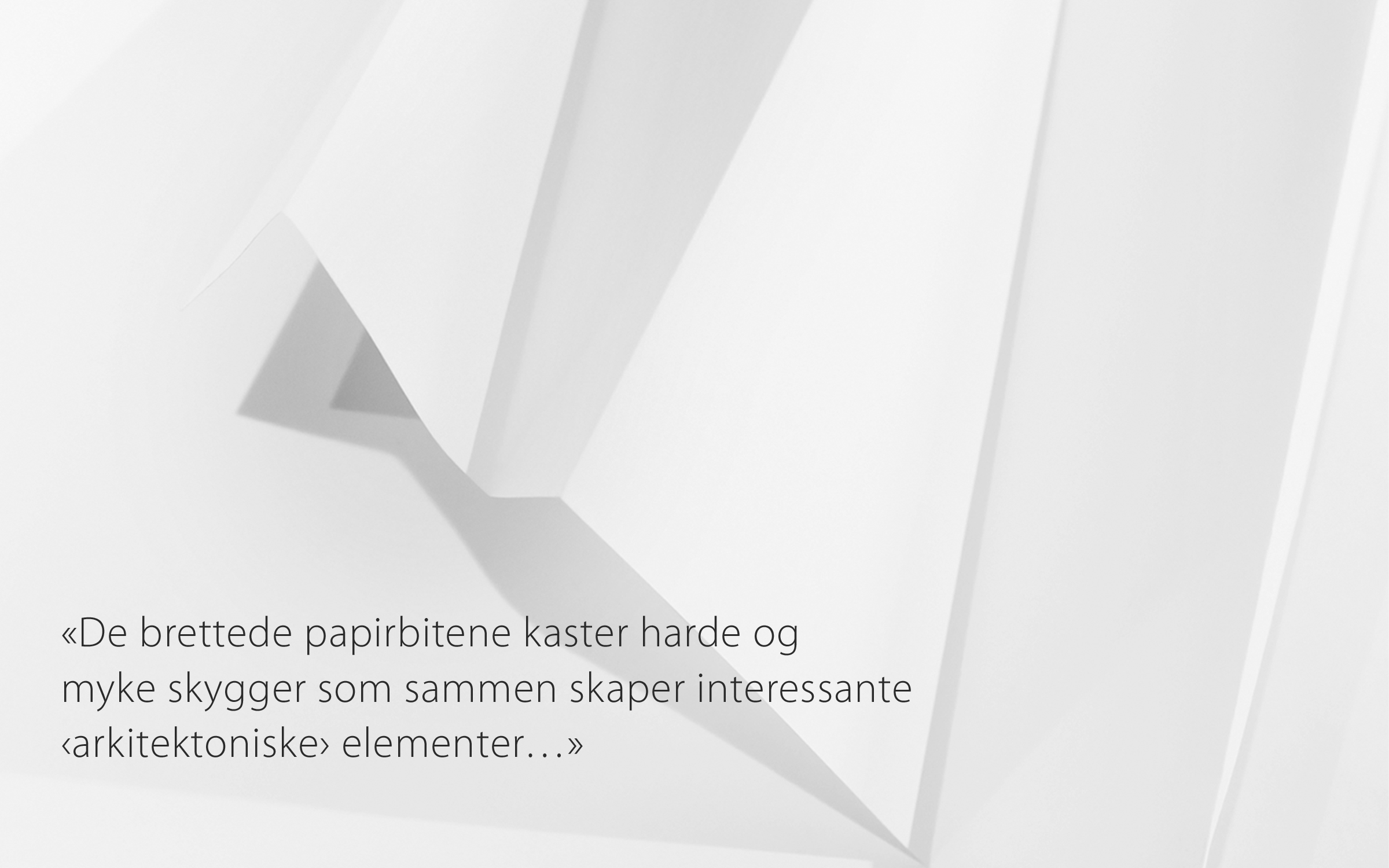
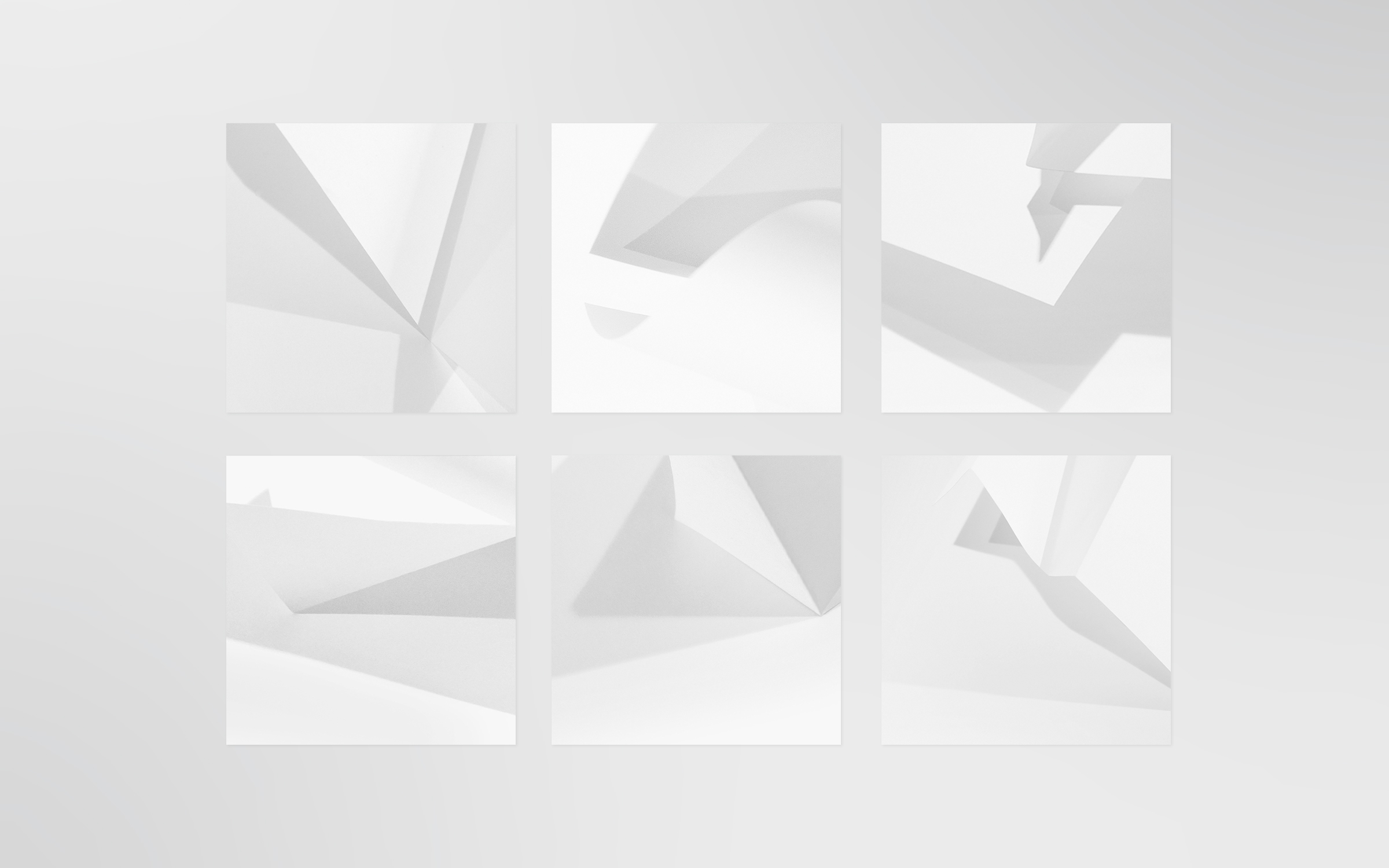
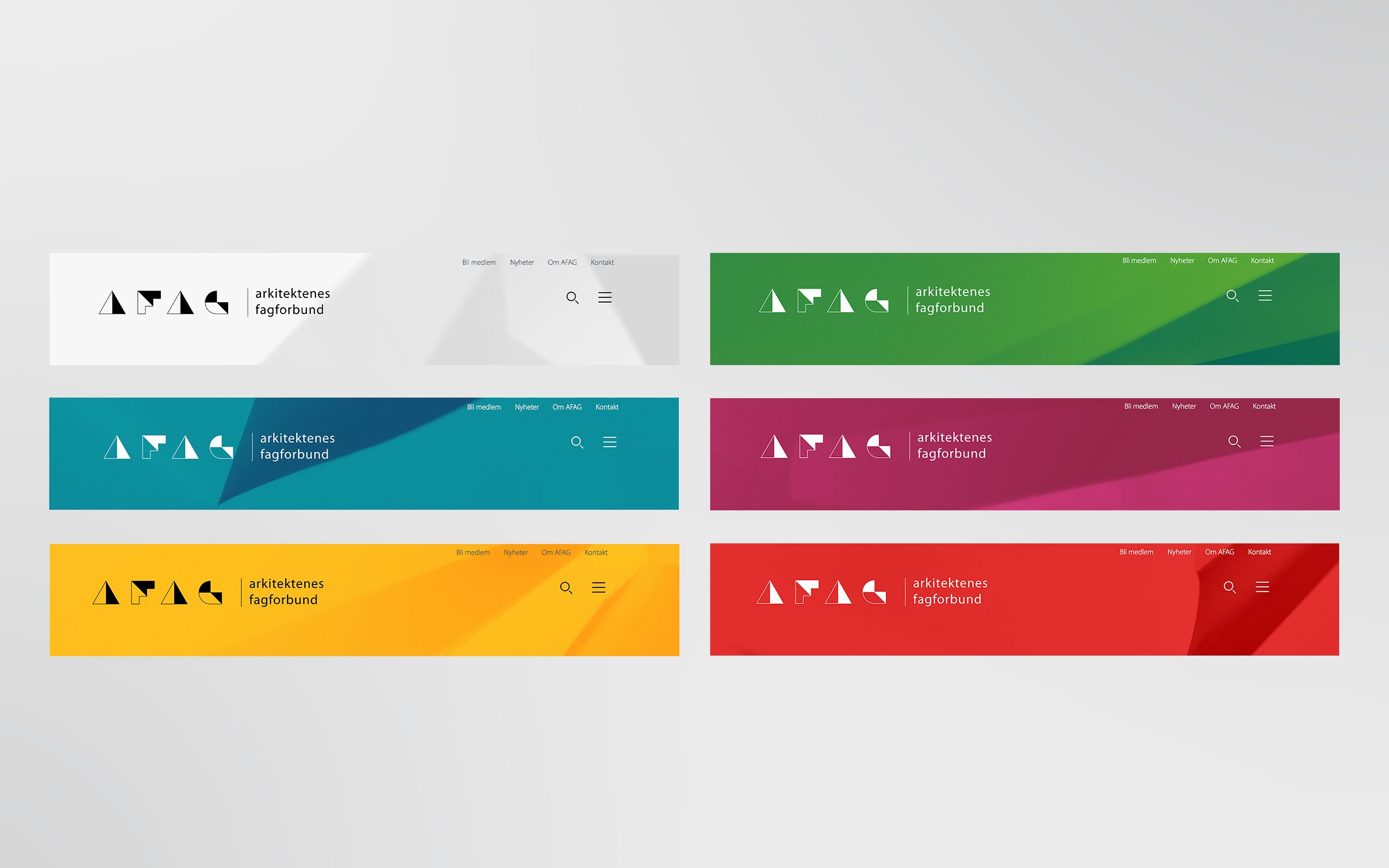
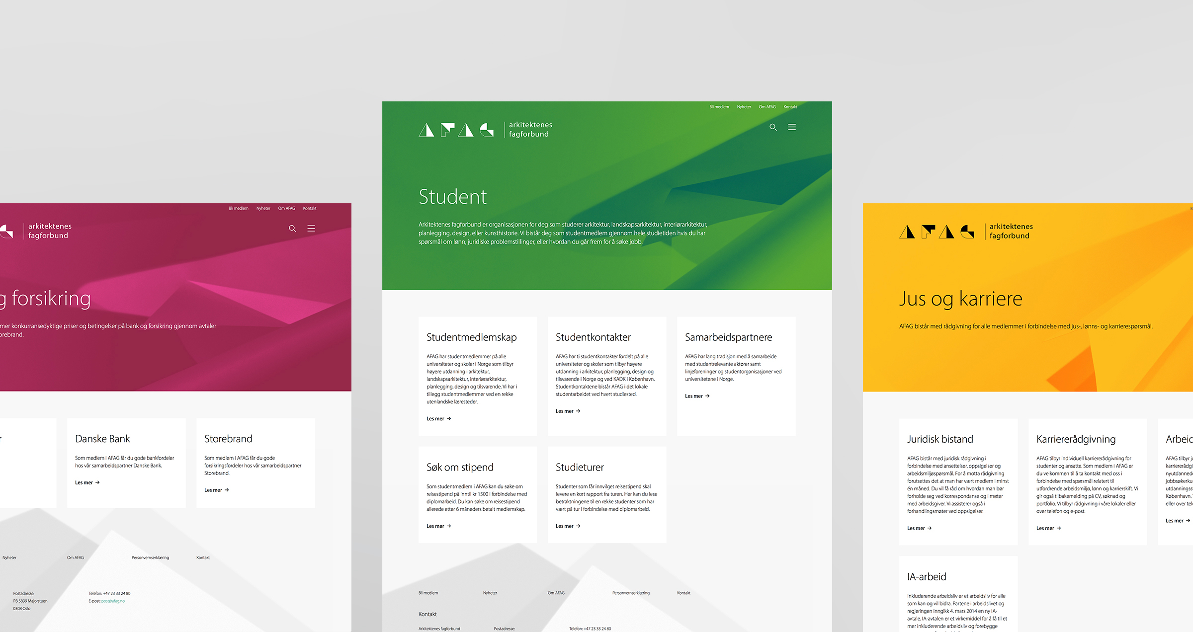
The project was part of a larger renewal process for the union, where we also have been redesigning the logo and visual identity.The logo is based on the concept of cutting and folding paper. Furthermore the abstract structures used on the website as design elements are the result of simple play with paper and light, resulting in clean and light architectural elements.
Type: Website
Services: Webdesign / Creative-Direction / Design
Realized: 2017
Industry: Architecture
Client: Arkitektenes fagforbund AFAG (the Norwegian Union of Salaried Architects)
